Data Exercise, Week 8
This exercise has two purposes: first, to introduce you to electricity data, and second to build some new skills in R.
For this exercise, you’re going to apply a couple of new and really important skills. First, you’re going to learn how to download data using an Application Programming Interface (API). Second, you’re going to use the functions skill we learned last week with the pipeline tolls assignment. You’re going to apply those skills to make some graphs of Alberta electricity prices and loads.
Registering for an API
If you’re going to use an API, you’ll need to register with the data provider for a key. That key is your unique identifier, and ties any activity you have on the site to your email address and identity.
For this exercise, you’ll need to sign up for a key for the Alberta Electric System Operator (AESO) API, which you can do here. Once you have signed up for an API account, and confirmed your email, you’ll have to subscribe to get an API key. Sign-in to the AESO API, click on products at the top right, and add a subscription to the AESO Public API.
Once you do that (give it any name you want), you should see something like this:
Click ‘Show’ for your primary key and you’re ready for the next step.
Using your .Rprofile file to store keys
Generally, you don’t want to share your API key, but you also want it to be loaded into R so that you can use it. So, how can you make this happen? One solution is to use your .Rprofile file that you’ll see is in the home directory for R.
How do you find the home directory for R? Open a clean session of R and type
getwd()and you’ll see it.
In your home directory, there will be a blank .Rprofile file that is, basically, R code that gets read each time you open an R session. You can store lots of stuff in there, and you can use it to create new variables with things like your AESO API key like this:
aeso_key<-"sdlkfjslkfjskldjhvklsHDFKJSDHFKJDSHFLDHFLDHFSHDKJShFCDKJshfhsjfkasHdjhsafkjshgvHDKJHSDkjbvDKJV"If you do this, each time you open an R session, you can use aeso_key where you need to use your key to access data.
Do not make an RMarkdown document that contains your API key. On future assignments, I will deduct marks if you do so (and, to be fair, there may be bonus marks if you can find any of my keys online).
You won’t necessarily get every aspect of this, and that’s fine. I want you to come away with a general knowledge that APIs exist, that R can scrape them, and that they are an efficient way to access data online. I won’t expect you to build your own API access code, but some of you might like to do so.
I’ve used multiple versions of the AESO API, so in my case the key for this new version of the API is stored as new_aeso_key which you’ll see in the code that follows.
On with the AESO data
As usual, we’ll start with a set of packages for this exercise, but in this case we’re going to add two new ones: jsonlite and httr. httr lets you access web-based data and jsonlite lets you read .json files which are a common and efficient output format for API data. You’ll need to install these packages if you haven’t done so already. We’ve seen lubridate before, but you’re really going to want to use it for this exercise too, so if you haven’t already installed it, you should.
library(tidyverse)
library(httr)
library(jsonlite)
library(lubridate)
library(janitor)
library(kableExtra)
library(scales)
Now, before we get to the data, what are we looking at? The Alberta Electric System Operator (AESO) runs Alberta’s wholesale electricity market, its transmission system (the grid), and ensures reliability of our electricity supply. At each instant, the AESO acts to ensure that electricity supply equals demand by dispatching new generating assets into the market as needed. Those generating assets each offer their generation into the market in block prices for each hour, so the AESO is literally working with a supply curve that we’ll look at in class.
In each hour, the quantity of electricity demand is referred to as load, and the market price that allows offered supply to equal load is what each generator (and each distributor) pays for electricity.
In this exercise, we’re going to graph prices and loads and some other bits and pieces using the AESO API.
Now, we’ll start by pulling 1 year of pool price data, current to today(!!!), from the AESO API (you can also download these data from here, but I’d like you to try it using the API).
API calls rely on web links with headers to access data. The headers send information to the API, and tell you what you want back. In this case, we’re going to use start dates (today’s date), and end date (one year ago), we’re going to tell it to give us json data, and you’ll need to know which API site you want to access:
For the pool price report, as you can see here, we’re going to need the
/v1.1/price/poolPriceAPI link.
And, we can access the data like so:
# we're going to need to convert our start and end dates to date format using ymd from lubridate
start_date<-Sys.Date()-years(1)
end_date<-Sys.Date()-days(1)

#using the GET command from httr, we'll access the API site
data <- GET(url="https://apimgw.aeso.ca/public/poolprice-api/v1.1/price/poolPrice",
    #add aeso key using the variable name you used in your .Rprofile
    add_headers("API-KEY" = new_aeso_key),
    #we want to add some other headers
    query = list(
      startDate = format(start_date, "%Y-%m-%d"),
      endDate = format(end_date, "%Y-%m-%d")))%>%
  httr::content()%>%

#and then we want to extract the data and convert it to a data frame
#I don't expect you to know how to do all of this of course
 pluck("return", "Pool Price Report") %>%
  enframe() %>%
  unnest_auto(value) %>%
  select(-name) %>%
  mutate(begin_datetime_mpt = ymd_hm(begin_datetime_mpt),
         begin_datetime_utc = ymd_hm(begin_datetime_utc))%>%
  clean_names()
If you run your code chunks to here, you should see that you have, in memory, an 8761 (or, if it’s a leap year, 8785) hour file with some pretty gross variable names and such. We’re going to clean that up, but since this is code we’re going to use over and over, let’s make a function to do it. Here, you’re basically creating a new command that you can run in R, you can send it some information, and it will send you output back. We’ll make a function to return some cleaned-up output from the AESO API, using the pool price report we just generated as a default:
aeso_prices<-function(key,start=ymd("2024-01-01"),end=ymd("2024-12-31")){ #these are default dates
  #default dates mean that if you run aeso_prices(key), it will use the 2024 year by default.

  GET(url="https://apimgw.aeso.ca/public/poolprice-api/v1.1/price/poolPrice",
    #add aeso key using the variable name you used in your .Rprofile
    add_headers("API-KEY" = key),
    #we want to add some other headers
    query = list(
      startDate = format(start, "%Y-%m-%d"),
      endDate = format(end, "%Y-%m-%d")))%>%
  httr::content()%>%
#and then we want to extract the data and convert it to a data frame
#I don't expect you to know how to do all of this of course
 pluck("return", "Pool Price Report") %>%
  enframe() %>%
  unnest_auto(value) %>%
  select(-name) %>%
  mutate(begin_datetime_mpt = ymd_hm(begin_datetime_mpt),
         begin_datetime_utc = ymd_hm(begin_datetime_utc))%>%
  clean_names() %>%
  rename(time_mt=begin_datetime_mpt,
         time_utc=begin_datetime_utc)%>%
  #code for hour ending, since a lot of electricity works on this
  mutate(he=hour(time_mt)+1,
         pool_price=as.numeric(pool_price),
         forecast_pool_price=as.numeric(forecast_pool_price),
         rolling_30day_avg=as.numeric(rolling_30day_avg)
         )
}

#you can now call this function anywhere below this chunk in your code to get a data frame of pool price data, like this:

#test_data<-aeso_prices(key=new_aeso_key,end=ymd("2024-01-02"))
Let’s try it to get today’s (!!!) data:
aeso_prices(key=new_aeso_key,start=Sys.Date(),end=Sys.Date()) %>% #get data for today!
     kbl(col.names = c('Time (UTC)', 'Time (Mountain)', 'Pool Price', 'Forecast Pool Price', 'Rolling 30 day avg','Hour ending')) %>%
    kable_styling(fixed_thead = T,bootstrap_options = c("hover", "condensed","responsive"),full_width = T)%>%
I() | Time (UTC) | Time (Mountain) | Pool Price | Forecast Pool Price | Rolling 30 day avg | Hour ending |
|---|---|---|---|---|---|
| 2026-04-02 06:00:00 | 2026-04-02 00:00:00 | 0.00 | 0.00 | 33.8 | 1 |
| 2026-04-02 07:00:00 | 2026-04-02 01:00:00 | 0.00 | 0.00 | 33.8 | 2 |
| 2026-04-02 08:00:00 | 2026-04-02 02:00:00 | 8.25 | 6.97 | 33.8 | 3 |
| 2026-04-02 09:00:00 | 2026-04-02 03:00:00 | 5.11 | 8.45 | 33.8 | 4 |
| 2026-04-02 10:00:00 | 2026-04-02 04:00:00 | 8.06 | 6.97 | 33.7 | 5 |
| 2026-04-02 11:00:00 | 2026-04-02 05:00:00 | 9.70 | 8.22 | 33.7 | 6 |
| 2026-04-02 12:00:00 | 2026-04-02 06:00:00 | 12.74 | 13.00 | 33.7 | 7 |
| 2026-04-02 13:00:00 | 2026-04-02 07:00:00 | 11.81 | 12.41 | 33.7 | 8 |
| 2026-04-02 14:00:00 | 2026-04-02 08:00:00 | 12.12 | 12.60 | 33.7 | 9 |
| 2026-04-02 15:00:00 | 2026-04-02 09:00:00 | 11.73 | 11.58 | 33.7 | 10 |
| 2026-04-02 16:00:00 | 2026-04-02 10:00:00 | NA | 10.05 | NA | 11 |
| 2026-04-02 17:00:00 | 2026-04-02 11:00:00 | NA | 11.28 | NA | 12 |
| 2026-04-02 18:00:00 | 2026-04-02 12:00:00 | NA | 11.28 | NA | 13 |
So, what are you actually seeing? Two time variables, one in local time and one in UTC, an actual and 3-hour-ahead forecast of the pool price, a rolling 30-day average pool price, and lastly an important thing about electricity markets: we tell time at the end of the hour. So he12 is the hour that ends at noon.
The fun thing about using a function is that now that we’ve made one, it’s easy to make a new version for different reports, like this one to get actual and forecast internal loads (or demand) measured in MW:
aeso_forecasts<-function(key,start=ymd("2024-01-01"),end=ymd("2024-12-31")){
  GET(url="https://apimgw.aeso.ca/public/actualforecast-api/v1/load/albertaInternalLoad",
    #add aeso key using the variable name you used in your .Rprofile
    add_headers("API-KEY" = new_aeso_key),
    #we want to add some other headers
    query = list(
      startDate = format(start, "%Y-%m-%d"),
      endDate = format(end, "%Y-%m-%d")))%>%
  httr::content()%>%

#and then we want to extract the data and convert it to a data frame
#I don't expect you to know how to do all of this of course
 pluck("return", "Actual Forecast Report") %>%
  enframe() %>%
  unnest_auto(value) %>%
  select(-name) %>%
  mutate(begin_datetime_mpt = ymd_hm(begin_datetime_mpt),
         begin_datetime_utc = ymd_hm(begin_datetime_utc))%>%
  clean_names() %>%
  rename(time_mt=begin_datetime_mpt,
         time_utc=begin_datetime_utc,
         ail=alberta_internal_load,
         forecast_ail=forecast_alberta_internal_load)%>%
  mutate(he=hour(time_mt)+1,
         ail=as.numeric(ail),
         forecast_ail=as.numeric(forecast_ail)
         )
}
Let’s try this one too:
aeso_forecasts(key=new_aeso_key,start=Sys.Date(),end=Sys.Date()) %>%
   kbl(col.names = c('Time (UTC)', 'Time (Mountain)', 'Internal Load', 'Forecast Load','Hour ending')) %>%
    kable_styling(fixed_thead = T,bootstrap_options = c("hover", "condensed","responsive"),full_width = T)%>%
I() | Time (UTC) | Time (Mountain) | Internal Load | Forecast Load | Hour ending |
|---|---|---|---|---|
| 2026-04-02 06:00:00 | 2026-04-02 00:00:00 | 10108 | 10083 | 1 |
| 2026-04-02 07:00:00 | 2026-04-02 01:00:00 | 9968 | 10003 | 2 |
| 2026-04-02 08:00:00 | 2026-04-02 02:00:00 | 9910 | 9908 | 3 |
| 2026-04-02 09:00:00 | 2026-04-02 03:00:00 | 9911 | 9914 | 4 |
| 2026-04-02 10:00:00 | 2026-04-02 04:00:00 | 9977 | 9938 | 5 |
| 2026-04-02 11:00:00 | 2026-04-02 05:00:00 | 10137 | 10152 | 6 |
| 2026-04-02 12:00:00 | 2026-04-02 06:00:00 | 10538 | 10506 | 7 |
| 2026-04-02 13:00:00 | 2026-04-02 07:00:00 | 10894 | 10849 | 8 |
| 2026-04-02 14:00:00 | 2026-04-02 08:00:00 | 10993 | 10985 | 9 |
| 2026-04-02 15:00:00 | 2026-04-02 09:00:00 | 11080 | 10994 | 10 |
| 2026-04-02 16:00:00 | 2026-04-02 10:00:00 | NA | 11115 | 11 |
| 2026-04-02 17:00:00 | 2026-04-02 11:00:00 | NA | 11091 | 12 |
| 2026-04-02 18:00:00 | 2026-04-02 12:00:00 | NA | 11041 | 13 |
| 2026-04-02 19:00:00 | 2026-04-02 13:00:00 | NA | 11033 | 14 |
| 2026-04-02 20:00:00 | 2026-04-02 14:00:00 | NA | 10985 | 15 |
| 2026-04-02 21:00:00 | 2026-04-02 15:00:00 | NA | 10968 | 16 |
| 2026-04-02 22:00:00 | 2026-04-02 16:00:00 | NA | 11005 | 17 |
| 2026-04-02 23:00:00 | 2026-04-02 17:00:00 | NA | 10962 | 18 |
| 2026-04-03 00:00:00 | 2026-04-02 18:00:00 | NA | 10824 | 19 |
| 2026-04-03 01:00:00 | 2026-04-02 19:00:00 | NA | 10766 | 20 |
| 2026-04-03 02:00:00 | 2026-04-02 20:00:00 | NA | 10822 | 21 |
| 2026-04-03 03:00:00 | 2026-04-02 21:00:00 | NA | 10725 | 22 |
| 2026-04-03 04:00:00 | 2026-04-02 22:00:00 | NA | 10454 | 23 |
| 2026-04-03 05:00:00 | 2026-04-02 23:00:00 | NA | 10198 | 24 |
So, now we have two separate functions that pull in price and load data, but I would rather we build a single data set, so let’s do that next using the left_join command. This will combine the data sets we pull in using common elements (times, he, etc) if they have common names, or you can tell it which variables to use to execute the merge.
Are you ready for this? It’s pretty cool and one of the more powerful things about using scripted statistical programming. We’re going to grab the 2025 year:
start_date<-ymd("2025-01-01")
end_date<-ymd("2025-12-31")
#since we have the same variable names, it will automatically join by common elements c("time_utc", "time_mt", "he")
aeso_combined<-aeso_forecasts(key=new_aeso_key,start = start_date,end=end_date)%>%
  left_join(aeso_prices(key=new_aeso_key,start=start_date,end=end_date))
If you run all your chunks to here, you should have an 8760x8 (or 8784x8 if it’s a leap year) data frame with prices and loads. We can show a subset (Christmas day from 10am-5pm) of our load and price data.
aeso_combined %>% filter(as_date(time_mt)==ymd("2025-12-25"),he>10,he<19)%>%
   kbl() %>%
    kable_styling(fixed_thead = T,bootstrap_options = c("hover", "condensed","responsive"),full_width = T)%>%
I() | time_utc | time_mt | ail | forecast_ail | he | pool_price | forecast_pool_price | rolling_30day_avg |
|---|---|---|---|---|---|---|---|
| 2025-12-25 17:00:00 | 2025-12-25 10:00:00 | 11555 | 11560 | 11 | 42.5 | 41.4 | 43.4 |
| 2025-12-25 18:00:00 | 2025-12-25 11:00:00 | 11588 | 11614 | 12 | 41.7 | 38.7 | 43.4 |
| 2025-12-25 19:00:00 | 2025-12-25 12:00:00 | 11596 | 11608 | 13 | 46.6 | 46.3 | 43.4 |
| 2025-12-25 20:00:00 | 2025-12-25 13:00:00 | 11574 | 11595 | 14 | 41.1 | 41.0 | 43.4 |
| 2025-12-25 21:00:00 | 2025-12-25 14:00:00 | 11644 | 11612 | 15 | 47.8 | 41.8 | 43.4 |
| 2025-12-25 22:00:00 | 2025-12-25 15:00:00 | 11773 | 11751 | 16 | 69.8 | 50.5 | 43.4 |
| 2025-12-25 23:00:00 | 2025-12-25 16:00:00 | 12019 | 12022 | 17 | 80.3 | 135.2 | 43.4 |
| 2025-12-26 00:00:00 | 2025-12-25 17:00:00 | 12030 | 12118 | 18 | 50.5 | 55.1 | 43.4 |
And, we can also make quick graphs of the data you’ve downloaded:
aeso_combined%>%ggplot()+
  geom_line(aes(time_mt,ail),color="black",linewidth=1.2)+
  scale_x_datetime(breaks=pretty_breaks(), expand=c(0,0))+
  scale_y_continuous(breaks=pretty_breaks(), expand=c(0,0))+
  labs(
      title = "Alberta Internal Load",
      y="Alberta Internal Load (MW)",x=NULL)+
    theme_minimal()+
  theme(plot.margin = unit(c(1,1,0.2,1), "cm"))
aeso_combined%>%ggplot()+
  geom_line(aes(time_mt,pool_price),color="black",linewidth=1.2)+
  scale_x_datetime(breaks=pretty_breaks(), expand=c(0,0))+
  scale_y_continuous(breaks=pretty_breaks(), expand=c(0,0))+
  labs(
      title = "Alberta Power Pool Prices",
      y="Alberta Pool Price ($/MWh)",x=NULL)+
    theme_minimal()+
  theme(plot.margin = unit(c(1,1,0.2,1), "cm"))
So, now you’ve learned three new skills: API data pulls, creating functions, and merging data files.
And we’ve made some ugly graphs.
Now, it’s time to clean this up using a really important data wrangling skill: grouping. And, a related graphing skill: ribbon plots.
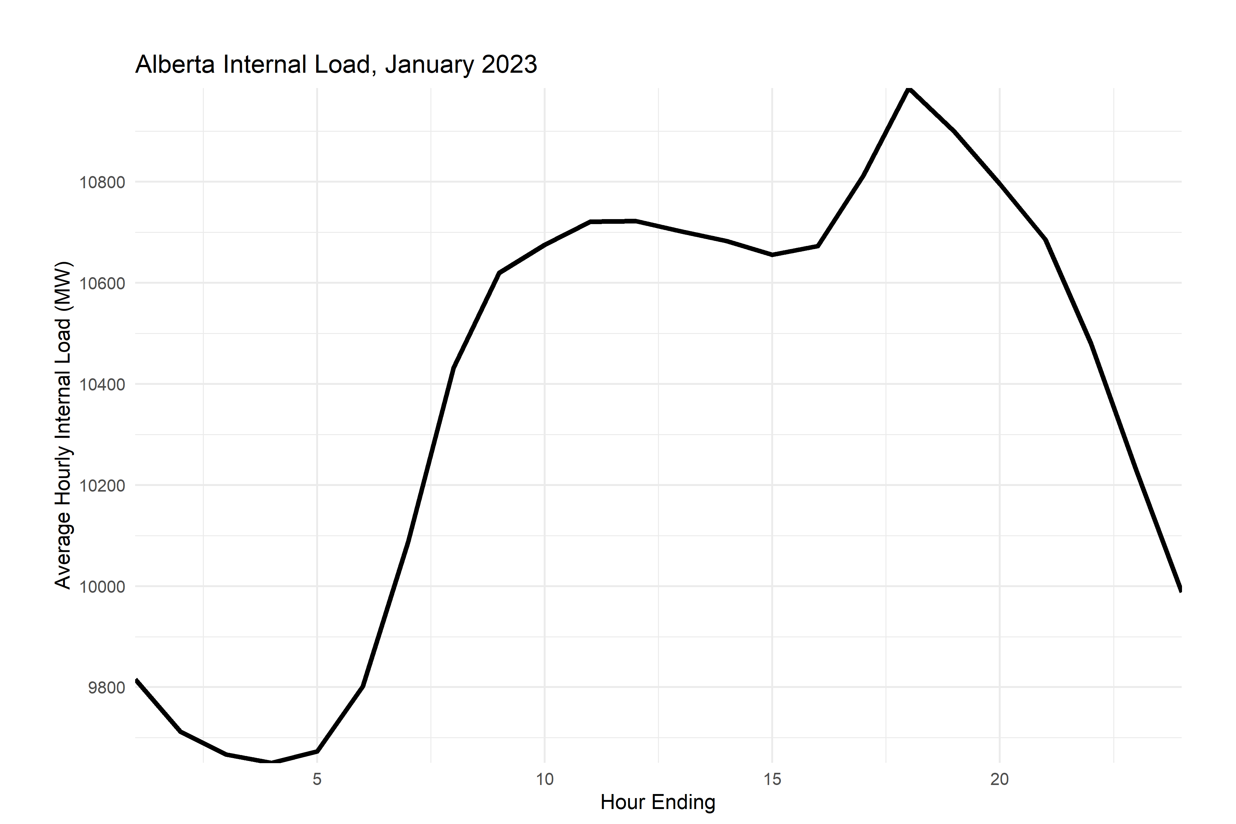
As you’ve seen before, group_by (and the related command ungroup) let you execute commands on data grouped by time, by another factor, etc. I use it often with mutate (to create group averages or deviations from the average) or summarize (to create monthly data from daily data, for example). In the example below, we’ll group by month and hour, and then summarize to get hourly means, min and max by month (e.g the mean, min, and max value at 2pm in January).
If you look at the graphs you’ve made, you probably already had the feeling that electricity load is seasonal and has daily variation too. We’ll use group_by and summarize to have a look at that.
Pay close attention to the steps in this code:
aeso_combined %>%
  mutate(month=month(time_utc))%>% # create month indicator variables
  filter(month==1)%>% #select january
  group_by(month,he) %>% #group data by month and he
  summarize(load=mean(ail,na.rm = T),# for each month and he pair, create a summary variable called internal_load that is equal to the mean of all the observations in that group
            load_min=min(ail), #and one for the miniumum
            load_max=max(ail), #and one for the maximum
  )%>%
  ggplot()+
  geom_line(aes(he,load),color="black",linewidth=1.2)+
  scale_x_continuous(breaks=pretty_breaks(), expand=c(0,0))+
  scale_y_continuous(breaks=pretty_breaks(), expand=c(0,0))+
  labs(
      title = "Alberta Internal Load, January 2025",
      y="Average Hourly Internal Load (MW)",x="Hour Ending")+
    theme_minimal()+
  theme(plot.margin = unit(c(1,1,0.2,1), "cm"))
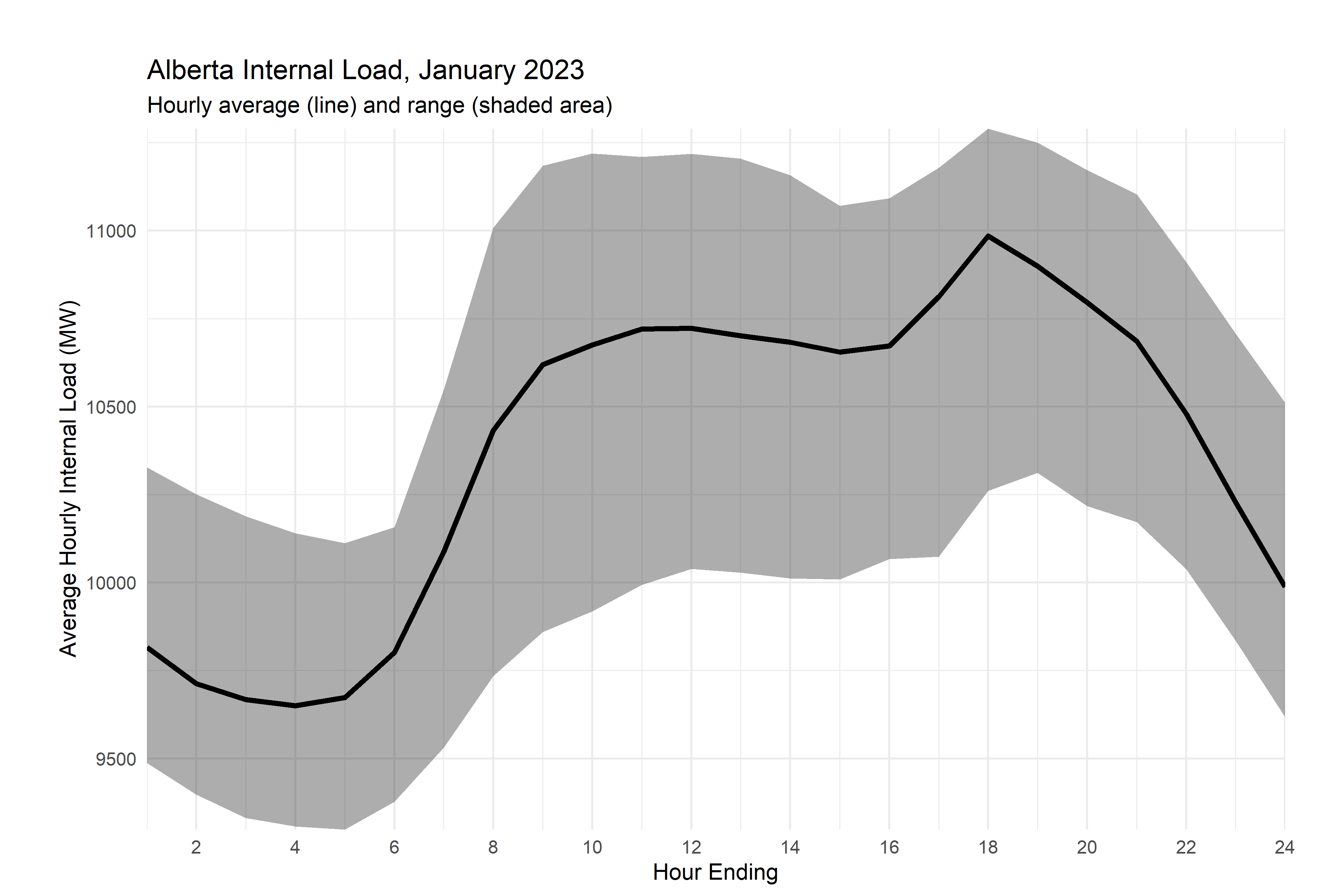
Now, that’s definitely seasonal, but there’s a bit that’s getting lost in the mix here - the range of possible values. Let’s use a ribbon plot for this and take advantage of the minima and maxima that we made earlier.
aeso_combined %>%
  mutate(month=month(time_utc))%>% # create month indicator variables
  filter(month==1)%>% #select january
  group_by(month,he) %>% #group data by month and he
  summarize(load=mean(ail,na.rm = T),# for each month and he pair, create a summary variable called internal_load that is equal to the mean of all the observations in that group
            load_min=min(ail), #and one for the miniumum
            load_max=max(ail), #and one for the maximum
  )%>%
  ggplot()+
  #LOOK HERE
  #adding in the ribbon
  geom_ribbon(aes(min=load_min,max=load_max,x=he),alpha=0.4)+
  geom_line(aes(he,load),color="black",linewidth=1.2)+
  scale_x_continuous(breaks=pretty_breaks(12), expand=c(0,0))+
  scale_y_continuous(breaks=pretty_breaks(), expand=c(0,0))+
  labs(
      title = "Alberta Internal Load, January 2025",
      subtitle = "Hourly average (line) and range (shaded area)",
      y="Average Hourly Internal Load (MW)",x="Hour Ending")+
    theme_minimal()+
  theme(plot.margin = unit(c(1,1,0.2,1), "cm"))
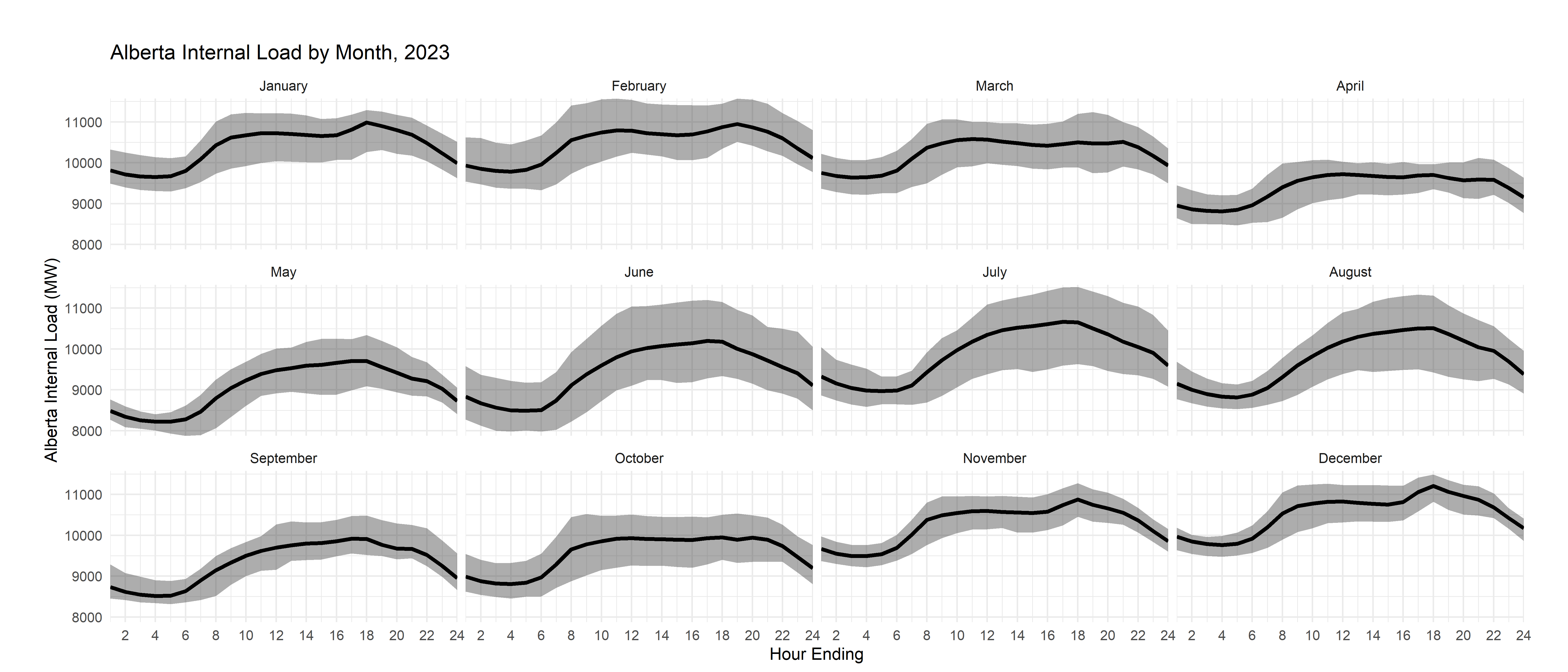
But, you know that there’s also variation across months, so let’s use a faceted plot to show that information.
# a function to label months
month_string <- function(month_sent) {
  #substr(string, 1, 1) <- toupper(substr(string, 1, 1))
  month.name[as.numeric(month_sent)]
}

aeso_combined %>%
  mutate(month=month(time_utc))%>% # create month indicator variables
  group_by(month,he) %>% #group data by month and he
  summarize(load=mean(ail,na.rm = T),# for each month and he pair, create a summary variable called internal_load that is equal to the mean of all the observations in that group
            load_min=min(ail), #and one for the miniumum
            load_max=max(ail), #and one for the maximum
  )%>%
  ggplot()+
  geom_ribbon(aes(min=load_min,max=load_max,x=he),alpha=0.4)+
  geom_line(aes(he,load),color="black",linewidth=1.2)+
  scale_x_continuous(breaks=pretty_breaks(12), expand=c(0,0))+
  scale_y_continuous(breaks=pretty_breaks(), expand=c(0,0))+
  #look here, adding in the facet wrap and the labeler - you send the variable month to the function month_string to get the label for the plot
  facet_wrap(~month,labeller = labeller(month=month_string))+
  labs(
      title = "Alberta Internal Load by Month, 2025",
      y="Alberta Internal Load (MW)",x="Hour Ending")+
    theme_minimal()+
  theme(plot.margin = unit(c(1,1,0.2,1), "cm"))
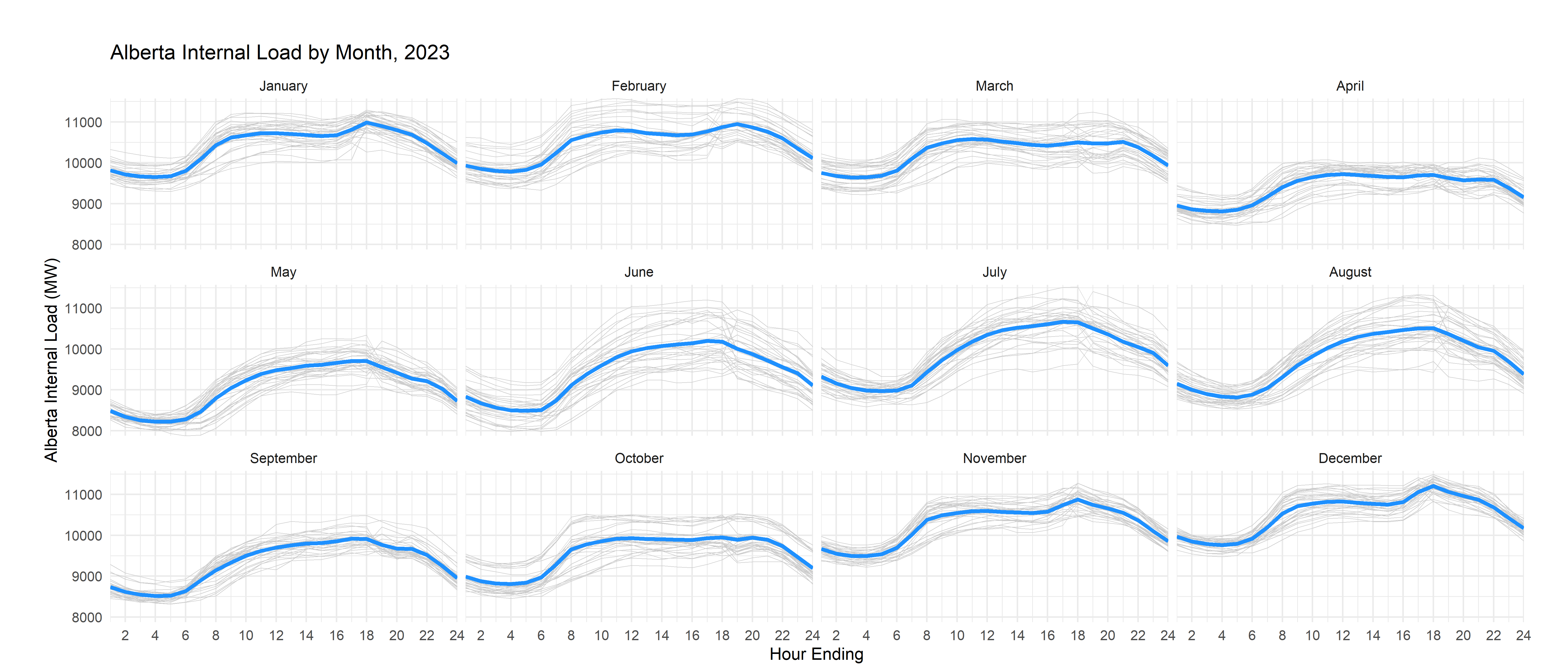
There’s another way to do this which, in some circumstances, you might prefer: instead of using the solid ribbon, you can trace individual daily lines in a lighter shade with thinner lines. Let me show you that alternative here:
month_string <- function(month_sent) {
  #substr(string, 1, 1) <- toupper(substr(string, 1, 1))
  month.name[as.numeric(month_sent)]
}
aeso_combined %>%
  #LOOK HERE: added days
  mutate(month=month(time_utc),
         day=day(time_utc))%>% # create month and day indicator variables
  group_by(month,he) %>% #group data by month and he
  #LOOK HERE
  #use mutate to create month/hour averages while keeping the original data
  mutate(load=mean(ail,na.rm = T),# for each month and he pair, create a summary variable called internal_load that is equal to the mean of all the observations in that group
            load_min=min(ail), #and one for the miniumum
            load_max=max(ail), #and one for the maximum
  )%>%
  ggplot()+
  #use thin lines with a lighter shade to graph each daily curve
  geom_line(aes(he,ail,group=day),color="grey80",linewidth=0.2)+
  # thicker lines for the means
  geom_line(aes(he,load),color="dodgerblue",linewidth=1.2)+
  scale_x_continuous(breaks=pretty_breaks(12), expand=c(0,0))+
  scale_y_continuous(breaks=pretty_breaks(), expand=c(0,0))+
  #look here, adding in the facet wrap and the labeler
  facet_wrap(~month,labeller = labeller(month=month_string))+
  labs(
      title = "Alberta Internal Load by Month, 2025",
      y="Alberta Internal Load (MW)",x="Hour Ending")+
    theme_minimal()+
  theme(plot.margin = unit(c(1,1,0.2,1), "cm"))
That’s a little inefficient, since it effectively draws a version of the mean line for each day, but it won’t change your life too much here.
Now, for your exercise, I’d like to see you reproduce a similar set of ribbon and spaghetti graphs for prices. Here’s the spaghetti plot for prices for your inspiration:
