library(kableExtra)
library(readxl)
library(janitor)
library(tidyverse)
library(lubridate)
library(scales)
library(viridis)
library(cowplot)Data Assignment #2 Solution
This assignment addresses two related subjects: the fiscal impact of oil and gas in Alberta and the pipelines we use to transport our oil and gas.
Canada is an energy exporting country, and our energy exports are an important source of income to governments, in particular in Alberta.
Let’s start with the pipelines that transport some of those exports. The Canada Energy Regulator produces pipeline profiles for the largest oil and gas pipelines in Canada, and also tracks other export-related data. The pipeline throughput and capacity data are available here. Crude oil export data sets are available here, while gas trade data are available here.
The US EIA also tracks crude oil imports from Canada and elsewhere, and often provides much more detail than the Canadian export data. Unfortunately, their new Application Programming Interface (API) is very cumbersome and so I’ve skipped teaching you that step and downloaded some data from their API for you to use for this assignment.
There are four deliverables for this assignment, and they build on skills we have already learned:
- a graph of throughput by grade and destination on the TransMountain pipeline;
- a graph of throughput and capacity on the NGTL System serving the Montney, Horn River and oil sands regions;
- a graph of US oil imports by origin (Canada vs Rest of the World) and refining region (US PADDs);
- a graph of Alberta resource royalty revenue over time.
To execute my versions of the deliverables that you see below, I’ve used the following packages. Use this as a guide to set up your document:
You may also find it useful to have a look at the Functions Demo before you start this assignment.
get_pipe_data<-function(pipe_name="Enbridge-Mainline"){
  names<-c("Alliance","Cochin","Enbridge-Mainline","Norman-Wells",
        "Keystone","MNP","Trans-Mountain","TQM","tcpl-mainline","Westcoast","ngtl")
pipe_data<-"No data"
if(pipe_name %in% names)
  {
  file_name<-paste("https://www.cer-rec.gc.ca/open/energy/throughput-capacity/",pipe_name,"-throughput-and-capacity.csv",sep="")
    local_file<-paste(pipe_name,".csv",sep="")
    download.file(file_name,local_file,mode="wb")
    pipe_data <- read_csv(file = local_file)%>%clean_names()%>%mutate(pipe_name=pipe_name)
  }
pipe_data
}
Deliverable 1: the Trans-Mountain Pipeline
The Trans-Mountain pipeline has been around since the 1950s and is the only major crude oil pipeline to cross the continental divide. Trans-Mountain is also unique in that it ships both crude oil and refined products in batches (other pipelines ship in batches too, just not with refined products in the mix). The following description is taken from the Trans-Mountain website”
Transmountain also has three delivery points: exports to the US via Sumas, deliveries to domestic refining in Burnaby, and a port delivery point at Westridge.
To see what gets delivered where on TransMountain, you should produce something like (but not necessarily identical to) this for TransMountain:
tm_data<-get_pipe_data(pipe_name="Trans-Mountain")%>% filter(key_point!="system")%>%mutate(
  trade_type=str_to_title(trade_type) ,
  product=str_to_title(product),
  pair=paste(key_point," (",trade_type,")",sep=""))


ggplot(tm_data,aes(date,throughput_1000_m3_d,group = product,fill=product)) +
  geom_area(position = "stack",,color="black",linewidth=.25) +
  scale_fill_manual("",values=viridis(n=4,alpha=1,begin=.7,end=0,option = "E",direction=-1))+
  scale_x_date(name=NULL,date_breaks = "1 years", date_labels =  "%b\n%Y",expand=c(0,0)) +
  scale_y_continuous(expand = c(0, 0),

                     sec.axis = sec_axis( trans=~.*1/.16, name="Shipments (Monthly, Thousands of Barrels per Day)")) +
  guides(alpha = guide_legend(override.aes = list(fill=viridis(n=3,alpha=1,begin=.8,end=0,option = "E",direction=-1)[1]),order = 10) ,
         fill = guide_legend(order = 1) )+
  facet_wrap(~pair,ncol = 1, scales = "free_y")+
  theme_classic() +
  theme(panel.border = element_blank(),
        panel.grid = element_blank(),
        panel.grid.major.y = element_line(color = "gray",linetype="dotted"),
        axis.line.x = element_line(color = "gray"),
        axis.line.y = element_line(color = "gray"),
        axis.text = element_text(size = 12),
        axis.text.x = element_text(margin = margin(t = 10)),
        axis.title = element_text(size = 12),
        #axis.label.x = element_text(size=20,vjust=+5),
        plot.subtitle = element_text(size = 12,hjust=0.5),
        plot.caption = element_text(face="italic",size = 12,hjust=0),
        legend.key.width=unit(2,"line"),
        legend.position = "bottom",
        legend.box = "vertical",
        #legend.direction = "horizontal",
        #legend.box = "horizontal",
        legend.text = element_text(size = 12),
        plot.title = element_text(hjust=0.5,size = 14))+
  labs(y="Shipments (Monthly, Thousands of Cubic Metres per Day)",x="Date",
       title=paste("Trans-Mountain Pipeline Shipments by Product and Destination",sep=""),
       caption="Source: CER Data for Trans-Mountain, graph by Andrew Leach.")
Hints:
To add the second y axis, use
scale_y_continuous(expand = c(0, 0),sec.axis = sec_axis( trans=~.*1/.16, name="Shipments (Monthly, Thousands of Barrels per Day)"))which translates the units using the multiplier in trans=~;
You’ll probably want to download a csv and look at it. You’ll also likely want to do some fixing of cases. You can do this in R or in your CSV (but it’s easier in R);
If you’re getting a weird looking graph, you’re probably graphing by year. Check your data to see what you really should be using.
geom_line(aes(date,available_capacity_1000_m3_d,color="Available Capacity"),linewidth=.85, lty="21") + scale_color_manual("",values=c("black"))
To get the stacked plots, use
facet_wrap(~key_point,ncol = 1, scales = "free_y")to allow different y-axes on each of the plots, and to stack the plots vertically if you like. You are not required to present them this way, but I do want to see a three-facet plot. You can also usefacet_grid(rows=vars(key_point))to get a slightly different look.
And, take note of what’s happened since the expansion was opened and what we’re moving on the pipeline now vs. before.
Deliverable 2: NGTL Expansions Serving the Oil Sands, Horn River, and Montney
The NGTL pipeline in Alberta and BC receives produced gas and delivers gas for both domestic use and exports. To see how that works, you’re going to make a graph of throughput and capacity in two oil sands delivery areas (OSDA), Liege which serves regions north of Fort McMurray including the mining and upgrading operations, and Kirby which serves regions in and around Cold Lake, along with the James River area which is the key bottleneck from the BC and Alberta Montney and Horn River gas plays.
It’s also a federally-regulated pipeline system so, I guess, blame Trudeau?
options(timeout=300)
if (!file.exists("ngtl_data.rdata") ||
    difftime(Sys.time(), file.info("ngtl_data.rdata")$mtime, units = "days") > 10)
  {
  ngtl_data<-get_pipe_data(pipe_name="ngtl")
  #filter(direction_of_flow=="east")
  save(ngtl_data,file = "ngtl_data.rdata")
}
load(file = "ngtl_data.rdata")


ggplot(
  #test<-
  ngtl_data %>%
         filter(key_point %in% c("Upstream of James River","OSDA Kirby","OSDA Liege"))%>%
         filter(date>=ymd("2011-01-01"))%>%
         rename(throughput=throughput_1000_m3_d,
                                                        capacity=capacity_1000_m3_d)) +
  geom_line(aes(date,throughput/1000,color="Throughput"),linewidth=0.85) +
  geom_line(aes(date,capacity/1000,color="Available Capacity"),linewidth=1.25, lty="21") +
  scale_x_date(name=NULL,date_breaks = "1 year", date_labels =  "%b\n%Y",expand=c(0,0)) +
  scale_color_manual("",values=c("black","firebrick"))+
  scale_y_continuous(expand = c(0, 0)) +
  guides(alpha = guide_legend(override.aes = list(fill=viridis(n=3,alpha=1,begin=.8,end=0,option = "E",direction=-1)[1]),order = 10) ,
         fill = guide_legend(order = 1) )+
  expand_limits(y=0)+
  facet_grid(rows=vars(key_point),scales="free_y")+
  theme_irpp(base_size=12)+
  theme(panel.spacing.y = unit(0.5, "cm"))+
  labs(y="Throughput or Capacity (Millions of Cubic Metres per Day)",x="Date",
    title=paste("NGTL System Throughput and Capacity (Montney and Oil Sands)",sep=""),
       caption="Source: CER Data for NGTL, graph by Andrew Leach.")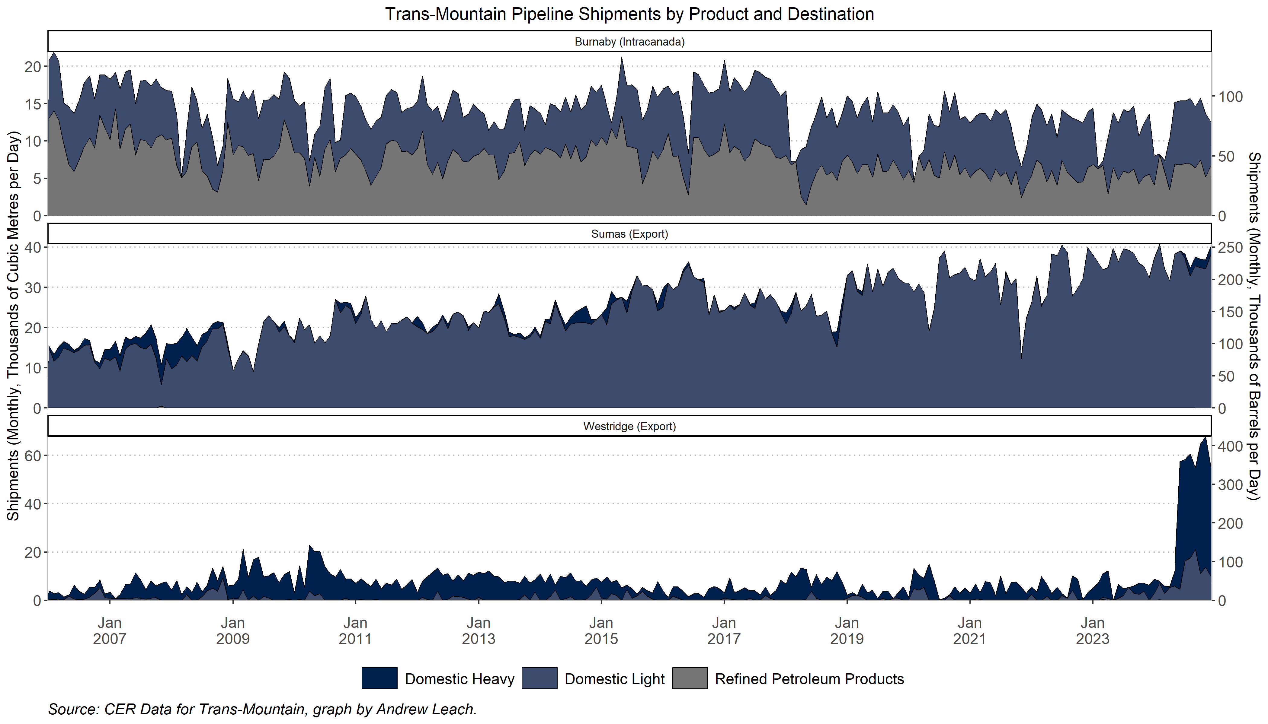
options(timeout=300)
if (!file.exists("ngtl_data.rdata") ||
    difftime(Sys.time(), file.info("ngtl_data.rdata")$mtime, units = "days") > 10)
  {
  ngtl_data<-get_pipe_data(pipe_name="ngtl")
  #filter(direction_of_flow=="east")
  save(ngtl_data,file = "ngtl_data.rdata")
}
load(file = "ngtl_data.rdata")


ggplot(
  #test<-
  ngtl_data %>%
        #filter(key_point %in% c("OSDA Kirby"))%>%
        filter(key_point %in% c("OSDA Kirby","OSDA Liege"))%>%
         #filter(date>=ymd("2011-01-01"))%>%
         rename(throughput=throughput_1000_m3_d,
                                                        capacity=capacity_1000_m3_d)) +
  geom_line(aes(date,throughput/1000,color="Throughput"),linewidth=0.85) +
  geom_line(aes(date,capacity/1000,color="Available Capacity"),linewidth=1.25, lty="21") +
  scale_x_date(name=NULL,date_breaks = "1 year", date_labels =  "%b\n%Y",expand=c(0,0)) +
  scale_color_manual("",values=c("black","firebrick"))+
  scale_y_continuous(expand = c(0, 0),

                     sec.axis = sec_axis( trans=~.*0.035314666, name="Throughput or Capacity (Billion Cubic Feet per Day)")) +
  guides(alpha = guide_legend(override.aes = list(fill=viridis(n=3,alpha=1,begin=.8,end=0,option = "E",direction=-1)[1]),order = 10) ,
         fill = guide_legend(order = 1) )+
  expand_limits(y=0)+
  facet_wrap(~key_point,ncol=1)+
  theme_irpp(base_size=14)+
  theme(panel.spacing.y = unit(0.5, "cm"))+
  labs(y="Throughput or Capacity (Millions of Cubic Metres per Day)",x="",
    #title=paste("NGTL System Throughput and Capacity Oil Sands",sep=""),
     #  caption="Source: CER Data for NGTL, graph by Andrew Leach."
    )
Hints:
To add a capacity line, just add an extra
geom_lineobject to your graph. This let’s me show you a neat trick too - if you name the colour in a ggplot aesthetic, this will carry through to your legends.
The NGTL data files are large, so depending on the speed of your conneciton, you may get timeout errors. If you do, just add the command options(timeout=300) to your code before you call the download command. You likely also want to make sure you’re not downloading them every time you run your code, so use an if(!file.exists..) in your code as we’ve done before;
If you don’t like the look of the provided daily data, you can use a monthly average throughput, by adding something like this to your code:
group_by(month,year,key_point)%>%
         mutate(throughput_1000_m3_d=mean(throughput_1000_m3_d))%>%
         ungroup()
You can also try something a bit more interesting and use a rolling mean. Using the
zoolibrary, you could do something like this:
group_by(key_point)%>%
         #mutate(throughput_1000_m3_d=mean(throughput_1000_m3_d))%>%
         mutate(throughput_1000_m3_d=zoo::rollmean(throughput_1000_m3_d,30,align = "right",na.pad = TRUE))%>%
         ungroup()%>%
         filter(!is.na(throughput_1000_m3_d))
You should specify in your subtitle or somewhere on your graph if and how you’ve gone from the provided daily data to a smoother series. Like this:
ggplot(
  #test<-
  ngtl_data %>%
         filter(key_point %in% c("Upstream of James River","OSDA Kirby","OSDA Liege"))%>%
         filter(date>=ymd("2011-01-01"))%>%
         group_by(key_point)%>%
         mutate(throughput_1000_m3_d=zoo::rollmean(throughput_1000_m3_d,30,align = "right",na.pad = TRUE))%>%
         ungroup()%>%
         filter(!is.na(throughput_1000_m3_d))%>%
         mutate(key_point=as_factor(key_point))%>%
         rename(throughput=throughput_1000_m3_d,
                                                        capacity=capacity_1000_m3_d)) +
  geom_line(aes(date,throughput/1000,color="Throughput"),linewidth=0.85) +
  geom_line(aes(date,capacity/1000,color="Available Capacity"),linewidth=1.25, lty="21") +
  scale_fill_manual("",values=viridis(n=4,alpha=1,begin=.7,end=0,option = "E",direction=-1))+
  scale_x_date(name=NULL,date_breaks = "1 year", date_labels =  "%b\n%Y",expand=c(0,0)) +
  scale_color_manual("",values=c("black","firebrick"))+
  scale_y_continuous(expand = c(0, 0)) +
  guides(alpha = guide_legend(override.aes = list(fill=viridis(n=3,alpha=1,begin=.8,end=0,option = "E",direction=-1)[1]),order = 10) ,
         fill = guide_legend(order = 1) )+
  expand_limits(y=0)+
  facet_grid(rows=vars(key_point),scales="free_y")+
  theme_irpp(base_size=12)+
  theme(panel.spacing.y = unit(0.5, "cm"))+
  labs(y="Throughput or Capacity (Millions of Cubic Metres per Day)",x="Date",
       title=paste("NGTL System Throughput and Capacity (Montney and Oil Sands)",sep=""),
       subtitle="Trailing 30-day average throughput and monthly available capacity",
       caption="Source: CER Data for NGTL, graph by Andrew Leach.")
Deliverable 3: US imports of Canadian crude
We haven’t talked a lot about the US market, but it’s worth having a sense of how the US relies on imports, where that oil comes from, and where it is refined. Using data that I’ve provided for you here, you should be able to reproduce a graph that looks like this one for use imports by grade and refining region. Note that refining regions give you a better sense of where demand lies, rather than a focus on the import port or pipeline border crossing point.
assignment_data_conf<-read_csv("assignment_2_data.csv")%>%
  mutate(destination_name=as_factor(destination_name))

  import_plot<-
    ggplot(
      assignment_data_conf%>%
              #mutate(origin_name=as_factor(origin_name))%>%
              #mutate(origin_name=fct_relevel(origin_name,"ROW"))%>%
              #mutate(origin_name=fct_recode(origin_name,"Rest of the World"="ROW")
              mutate(origin_name=gsub("ROW","Rest of the World",origin_name)
      ))+
  geom_area(aes(period,quantity,group=origin_name,fill=origin_name),color="black",linewidth=0.25,position="stack")+
  scale_x_date(expand=c(0,0))+
  scale_y_continuous(breaks=pretty_breaks(), expand=c(0,0))+
  #look here, adding in the facet wrap and the labeler
  facet_grid(cols=vars(destination_name),rows=vars(grade_name))+
  expand_limits(y=c(0,140))+
  #scale_fill_manual("",values=c("darkblue","red"))+
  scale_fill_manual("",values=c("red","darkblue"))+
  theme_classic() +
  theme(panel.border = element_blank(),
        panel.grid = element_blank(),
        panel.grid.major.y = element_line(color = "gray",linetype="dotted"),
        axis.line.x = element_line(color = "gray"),
        axis.line.y = element_line(color = "gray"),
        axis.text = element_text(size = 12),
        axis.text.x = element_text(margin = margin(t = 10)),
        axis.title = element_text(size = 12),
        #axis.label.x = element_text(size=20,vjust=+5),
        plot.subtitle = element_text(size = 12,hjust=0.5),
        plot.caption = element_text(face="italic",size = 12,hjust=0),
        legend.key.width=unit(2,"line"),
        legend.position = "bottom",
        legend.box = "vertical",
        #legend.direction = "horizontal",
        #legend.box = "horizontal",
        legend.text = element_text(size = 12),
        plot.title = element_text(hjust=0.5,size = 14))+
    theme(text = element_text(size=16))+
    theme(legend.position = "bottom", legend.box = "vertical",
        legend.margin=margin(t = 0,b=0, unit='cm'))+
  #t, r, b, l (To remember order, think trouble)
  theme(plot.margin = unit(c(1,1,0.2,1), "cm"))+
  guides(color = guide_legend(keywidth = unit(1.6,"cm"),nrow = 1),
    linetype = guide_legend(keywidth = unit(1.6,"cm"),nrow = 1))+
    labs(y="Imports (thousands of barrels per day)",x="",
         title="US Crude Imports from Canada and the Rest of the World (ROW)",
         subtitle="Imports by Refining PADD and Grade",
         caption = paste("Data via US Energy Information Administration, current to ",format(max(assignment_data$period),"%B %Y"),". Graph by Andrew Leach.",sep="")
         )+
  NULL

  import_plot_factors<-
    ggplot(
      assignment_data_conf%>%
              mutate(origin_name=as_factor(origin_name))%>%
              mutate(origin_name=fct_relevel(origin_name,"ROW"))%>%
              mutate(origin_name=fct_recode(origin_name,"Rest of the World"="ROW")
              #mutate(origin_name=gsub("ROW","Rest of the World",origin_name)
      ))+
  geom_area(aes(period,quantity,group=origin_name,fill=origin_name),color="black",linewidth=0.25,position="stack")+
  scale_x_date(expand=c(0,0))+
  scale_y_continuous(breaks=pretty_breaks(), expand=c(0,0))+
  #look here, adding in the facet wrap and the labeler
  facet_grid(cols=vars(destination_name),rows=vars(grade_name))+
  expand_limits(y=c(0,140))+
  scale_fill_manual("",values=c("darkblue","red"))+
  #scale_fill_manual("",values=c("red","darkblue"))+
  theme_classic() +
  theme(panel.border = element_blank(),
        panel.grid = element_blank(),
        panel.grid.major.y = element_line(color = "gray",linetype="dotted"),
        axis.line.x = element_line(color = "gray"),
        axis.line.y = element_line(color = "gray"),
        axis.text = element_text(size = 12),
        axis.text.x = element_text(margin = margin(t = 10)),
        axis.title = element_text(size = 12),
        #axis.label.x = element_text(size=20,vjust=+5),
        plot.subtitle = element_text(size = 12,hjust=0.5),
        plot.caption = element_text(face="italic",size = 12,hjust=0),
        legend.key.width=unit(2,"line"),
        legend.position = "bottom",
        legend.box = "vertical",
        #legend.direction = "horizontal",
        #legend.box = "horizontal",
        legend.text = element_text(size = 12),
        plot.title = element_text(hjust=0.5,size = 14))+
    theme(text = element_text(size=16))+
    theme(legend.position = "bottom", legend.box = "vertical",
        legend.margin=margin(t = 0,b=0, unit='cm'))+
  #t, r, b, l (To remember order, think trouble)
  theme(plot.margin = unit(c(1,1,0.2,1), "cm"))+
  guides(color = guide_legend(keywidth = unit(1.6,"cm"),nrow = 1),
    linetype = guide_legend(keywidth = unit(1.6,"cm"),nrow = 1))+
    labs(y="Imports (thousands of barrels per day)",x="",
         title="US Crude Imports from Canada and the Rest of the World (ROW)",
         subtitle="Imports by Refining PADD and Grade",
         caption = paste("Data via US Energy Information Administration, current to ",format(max(assignment_data$period),"%B %Y"),". Graph by Andrew Leach.",sep="")
         )+
  NULL

  ggsave("../../slides/oil_transp/import_plot.png",plot = import_plot_factors,dpi=400,width=14,height=7,bg="white")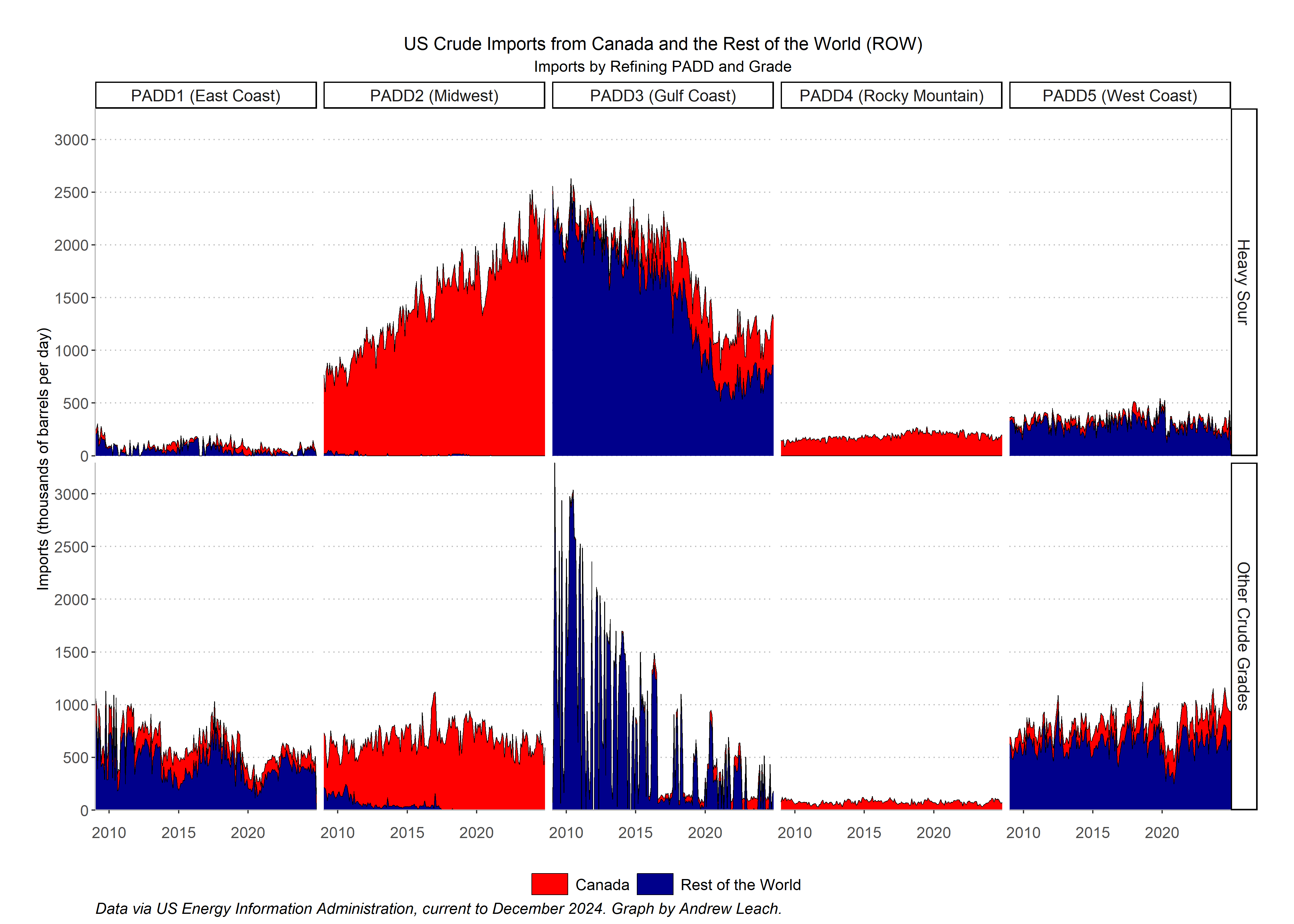
Hints:
If you want to have the PADDs in the same order as my plot, use this after you read the data:
mutate(destination_name=as_factor(destination_name)
If you want to have regions in the reverse order:
mutate(origin_name=as_factor(origin_name))%>% mutate(origin_name=fct_relevel(origin_name,"ROW"))%>% mutate(origin_name=fct_recode(origin_name,"Rest of the World"="ROW")
Think about your facet_grid elements (rows and cols), your grouping of data, and your fill aesthetic.’
Deliverable 4: Alberta Resource Royalties
Alberta’s budget is always a big economic news day, and resource royalties are always a big part of the story. In the last few fiscal years, resource royalties have hit record levels but this year looks to be a big downturn. To have some perspective on these decisions, let’s make a plot of Alberta resource royalties by product over time. I’ve updated the data that are provided here with my own file that covers up to the last fiscal update here. Use my data to create a graph similar to the following:
options(timeout=300)

if(!file.exists("budget.csv"))
  download.file("https://econ366.aleach.ca/files/budget.csv",destfile ="budget.csv",mode="wb")
#  download.file("https://open.alberta.ca/dataset/382b7a1e-9c34-47c7-9531-38e67ca5441d/resource/1373ea7a-ae5d-4ef7-acf7-7a966adb#21d5/download/em-alberta-historical-royalty-revenue-2024-2025.xlsx",destfile ="royalties.xlsx",mode="wb" )
royalties<-read_csv("budget.csv")%>%rename("product"=series)


ggplot(royalties%>%mutate(product=as_factor(product))%>%

                  filter(product!="Non Renewable Resource Revenue")%>%
                  filter(!product%in% c("Special Features","ARTC"))%>%
                            filter(product!="Total Government Revenue")
                          )+
  geom_col(aes(year,royalties/1000,fill=product),linewidth=.25) +
  scale_fill_manual("",values=colors_ua10())+
  scale_x_continuous(expand=c(0,0),breaks=pretty_breaks(10)) +
  scale_color_manual("",values=c("black"))+
  scale_y_continuous(expand = c(0, 0)) +
  guides(alpha = guide_legend(override.aes = list(fill=viridis(n=3,alpha=1,begin=.8,end=0,option = "E",direction=-1)[1]),order = 10) ,
         fill = guide_legend(order = 1) )+
  theme_irpp(base_size=15)+
  labs(y="Royalty Revenue (CA$ Billions)",x="",
       title=paste("Alberta Royalty Revenue",sep=""),
       caption="Source: Government of Alberta data, graph by Andrew Leach.")
Hints:
You do not need to replicate the U of A colours.
Context: notice how much more important natural gas royalties used to be in Alberta!
RMD File and HTML/PDF Preparation
As before, use the basic RMD file to complete this (and future) assignments, just rename it assignment 2. You only need to submit the HTML.