options(scipen = 999)
library(viridis)
library(forcats)
library(tidyverse)
library(httr)
library(jsonlite)
library(lubridate)
library(janitor)
library(kableExtra)
library(scales)Final Data Exercise
This data exercise is meant to reinforce a skill you’ve seen already, using and manipulating factors using the forcats package, and introduces a new tool, using pivot_wider to go from long to wide data.
We’ll also reinforce some skills from the earlier exercises including a lot of work with generating variables using mutate or summarize commands after grouping.
For this week, you’re going to be working close to home. Well, close to my home. We’re going to work with data from my own household power monitor, looking at both consumption and generation from my solar power system. Along the way, you’re also going to learn about some of the regulations that apply to solar power generators in Alberta and the ways we’re billed for electricity consumption here in the province.
As usual, we’ll start with a set of packages for this exercise, and in this case we’re going to add a new one: forcats. forcats is a general utility package for working with factors or category variables (you’ll see it in action soon).
The data for this week is a pretty large data file, available in CSV here.
Sorry, I’m not giving you access to my household solar API!
Reading the Data
So, to get started, let’s read in the data. For data where it **REALLY* depends on making sure you have the right time zone, it’s perhaps worth reading it in with a specified time zone here too.
#using read_csv, upload the data
solar_data <- read_csv("hourly_solar.csv",locale = locale(tz="America/Denver"))
The data have info on how much electricity we use (consumptionEnergy),how much electricity we generate (generationEnergy), how much electricity we use that comes from the distribution grid (importedEnergy) and how much we (exportedEnergy) sell back to the grid, in one hour blocks, measured in kWh. Each period is identified with a starting (start) and ending (end) time which should read in as POSIXct objects. When you’re done with these data, you’ll probably know more than you should about our household, but being able to do this was part of why we installed solar in the first place.
For this exercise, I’m going to give you some information, but I also want you to work to fill in the blanks, both in terms of the R code and the relevant regulations and prices.
As usual, you might want to start with a look at the data:
#show me 2025
solar_data %>% filter(year(start)==2025,measure%in%c("generation","consumption"))%>%
  ggplot()+
  geom_line(aes(start,value,color=str_to_title(measure)))+
  scale_x_datetime(breaks=pretty_breaks(12), expand=c(0,0),date_labels = "%b\n%Y")+
  scale_y_continuous(breaks=pretty_breaks(), expand=c(0,0))+
  scale_color_brewer("",palette = "Set1")+
  labs(
      title = "Leach Household Electricity Consumption and Generation",
      y="Hourly Consumption or Generation (kWh)",x="")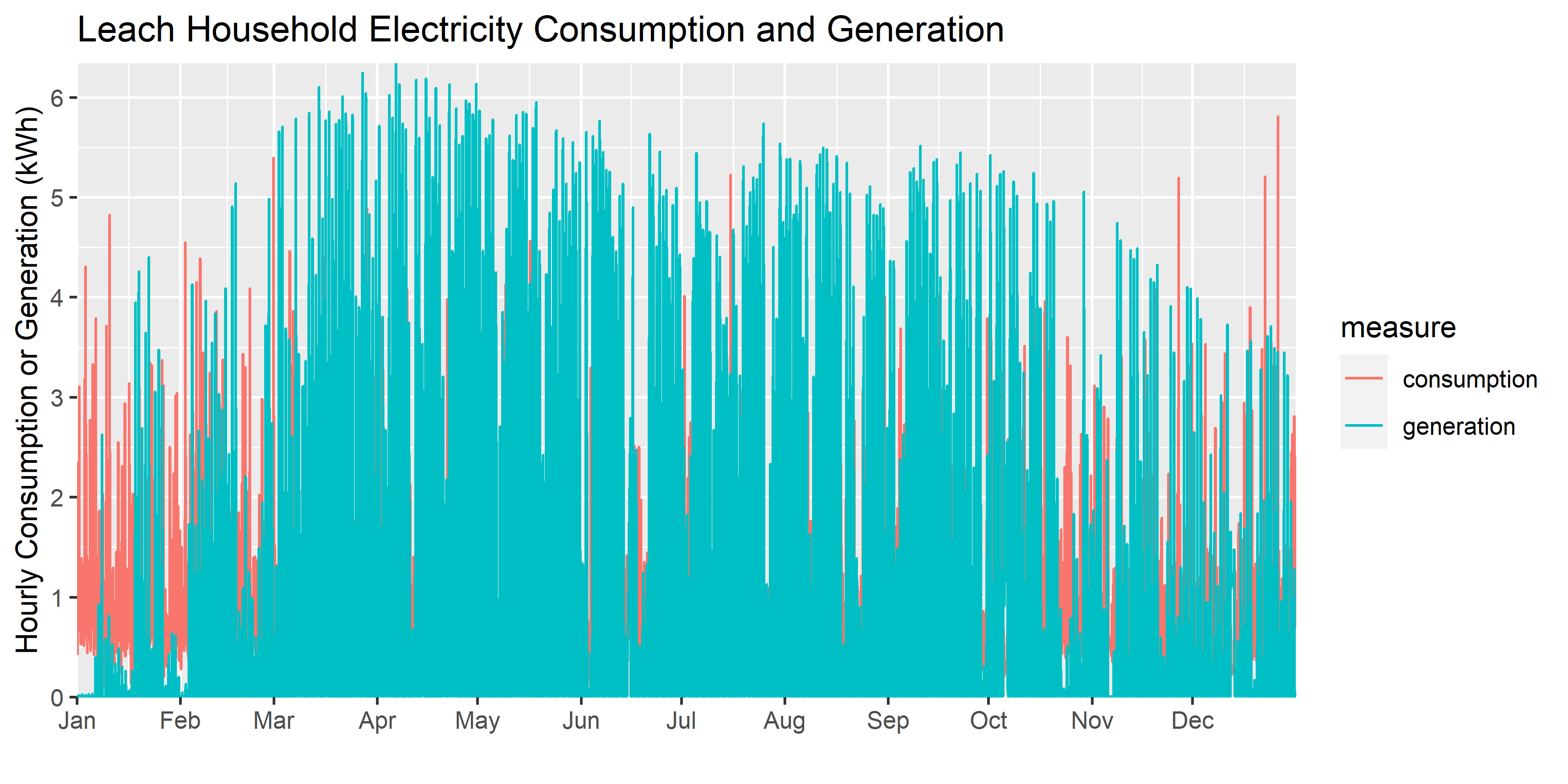
You’ll see that the data aren’t perfect: there are a few missing chunks. That’s not going to affect us too much, as we have more than enough to do the analysis we’ll need to do.
The first thing I’d like you to learn from this exercise is how to use factors. Factors are discrete category variables (e.g. TRUE or FALSE; months or the year; days of the week; etc) that we often find in data. You’ve used them before, you just haven’t really thought about it because ggplot uses them automatically: when you graphed data by scenario, or prices by crude stream, the R code in the background was treating each of those as factors even though, in your data, they were character strings. For example, in the (ugly) graph above, the consumption and generation fields are actually stored as factors once we get to the ggplot graph.
The sun doesn’t shine at night
Let me remind you how factors work using a subset of our data for my household. Suppose I want a graph of solar generation by month and by hour from 2025.
First, I need to filter and summarize the data, which we’ve learned previously.
#show me 2024
hourly_summary<- solar_data %>% filter(year(start)==2025,measure=="generation")%>%
  #make monthly and hourly category variables
  mutate(month=month.abb[month(start)],hour=hour(start))%>%
  #group by hour and month
  group_by(month,hour,measure)%>%
  summarise(generation=mean(value,na.rm=T))#create a variable for the mean and ignore any missing values
Now, I have a data set called hourly_summary that has variables for the month and the hour of the observation, and a measure named generation which is the mean generation for each month-hour pair. Now, let’s graph it:
hourly_summary %>%
  ggplot()+
  geom_line(aes(hour,generation,group=month,color=factor(month,levels=month.abb)),linewidth=1.15)+
  scale_color_discrete("")+
  guides(color=guide_legend(nrow = 1))+
  #scale_x_discrete(breaks=pretty_breaks(6), expand=c(0,0))+
  scale_y_continuous(breaks=pretty_breaks(), expand=c(0,0))+
  labs(
      y="Hourly Generation (kWh)",x="")+
  theme_update()+
  theme(legend.position = "bottom",
plot.margin = unit(c(1,1,0.2,1), "cm"))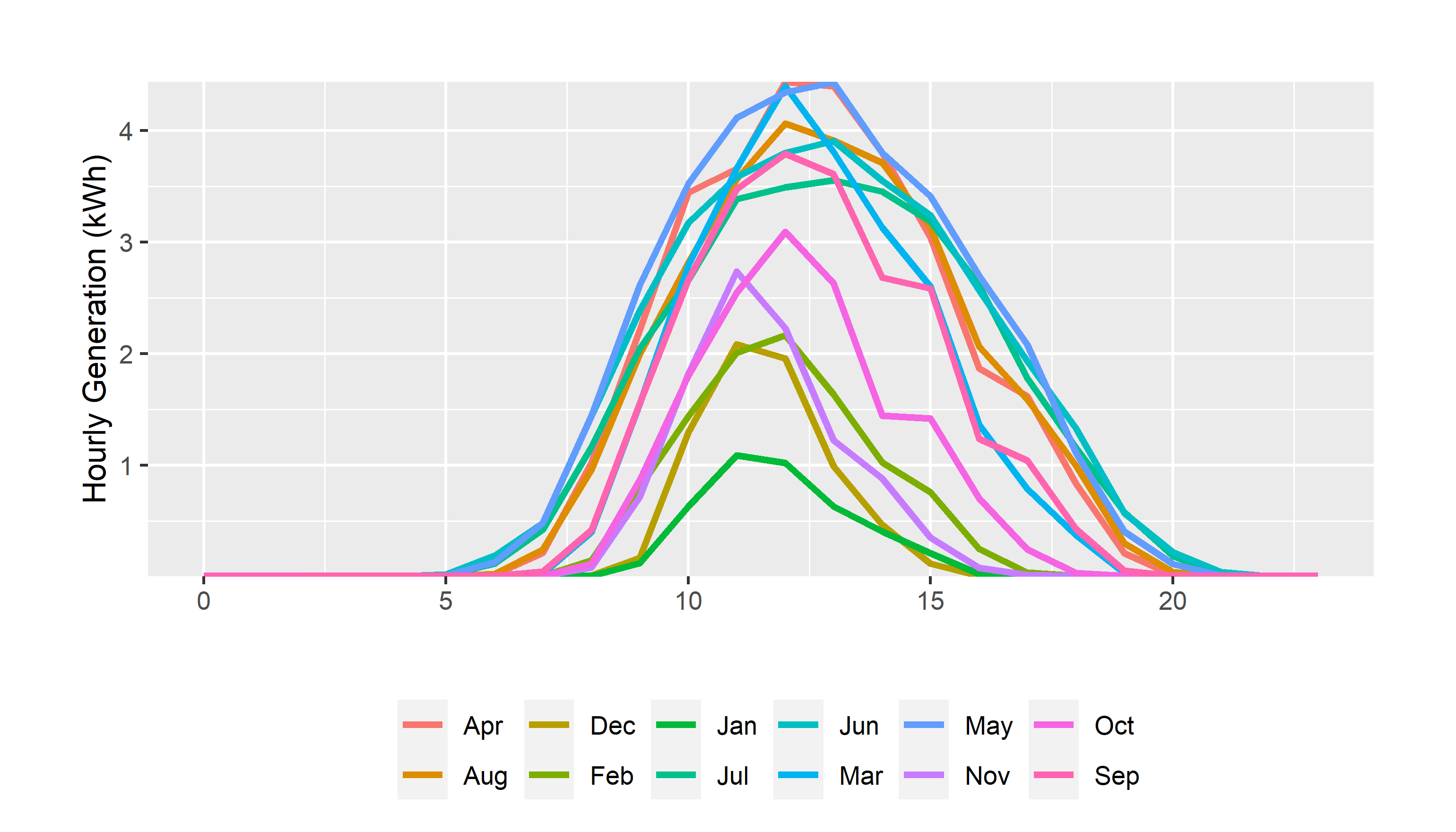
Well, that’s completely horrendous. Why would anyone order months like that?
Remember, R is like a 3 year old: it doesn’t know what you mean, only what you say. And, in this case, it doesn’t know that Jan, Feb, Mar, etc. are months, and it thinks you might want all those text labels organized alphabetically which, of course, you don’t.
Let’s start that over again, dealing explicitly with how I want the month factor variable to be used. Enter forcats!
#show me 2024
hourly_summary<- solar_data %>% filter(year(start)==2025,measure=="generation")%>%
  #make monthly and hourly category variables
  mutate(month=month.abb[month(start)],hour=hour(start),
  #as_factor creates factor "levels" in the order in which they appear by default
         month=as_factor(month))%>%
  #group by hour and month
  group_by(month,hour,measure)%>%
  summarise(generation=mean(value,na.rm=T))#create a variable for the mean and ignore any missing values


hourly_summary %>%
  mutate(month=as_factor(month))%>%
  ggplot()+
  geom_line(aes(hour,generation,group=month,color=month),linewidth=1.15)+
  #scale_x_discrete(breaks=pretty_breaks(6), expand=c(0,0))+
  scale_y_continuous(breaks=pretty_breaks(), expand=c(0,0))+
  scale_color_discrete("")+
  guides(color=guide_legend(nrow = 2))+
  labs(
      y="Hourly Generation (kWh)",x="")+
  theme_update()+
  theme(legend.position = "bottom",
plot.margin = unit(c(1,1,0.2,1), "cm"))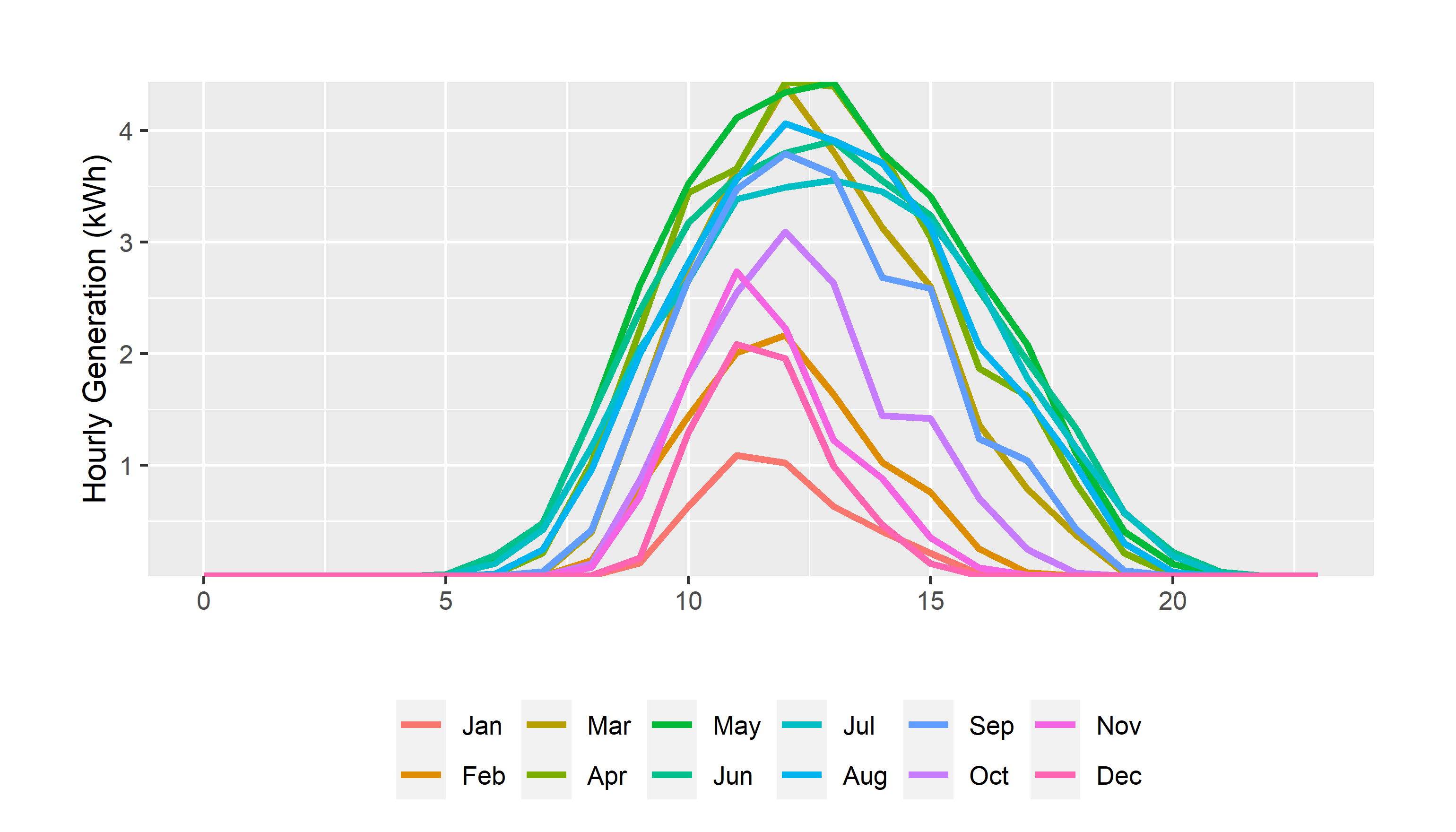
That’s better, but it wouldn’t work if we weren’t starting with a full year of data in chronological order.
It’s better to get in the habit of telling R, if you need to do so, how to order factors.
Note, the
month.abbvariable in r is a list of abbreviated months in order, e.g. (Jan, Feb, Mar).
# lets use all the data
hourly_summary<- solar_data %>% filter(measure=="generation")%>%
  #make monthly and hourly category variables
  mutate(month=month.abb[month(start)],hour=hour(start),
         #fct creates a factor and levels specifies the order in which factor levels should be assigned
         month=fct(month,levels=month.abb))%>%
  #group by hour and month
  group_by(month,hour,measure)%>%
  summarise(generation=mean(value,na.rm=T))#create a variable for the mean and ignore any missing values


hourly_summary %>%
  mutate(month=as_factor(month))%>%
  ggplot()+
  geom_line(aes(hour,generation,group=month,color=month),linewidth=1.15)+
  #scale_x_discrete(breaks=pretty_breaks(6), expand=c(0,0))+
  scale_y_continuous(breaks=pretty_breaks(), expand=c(0,0))+
  scale_color_discrete("")+
  guides(color=guide_legend(nrow = 2))+
  labs(
      y="Hourly Generation (kWh)",x="")+
  theme_update()+
  theme(legend.position = "bottom",
plot.margin = unit(c(1,1,0.2,1), "cm"))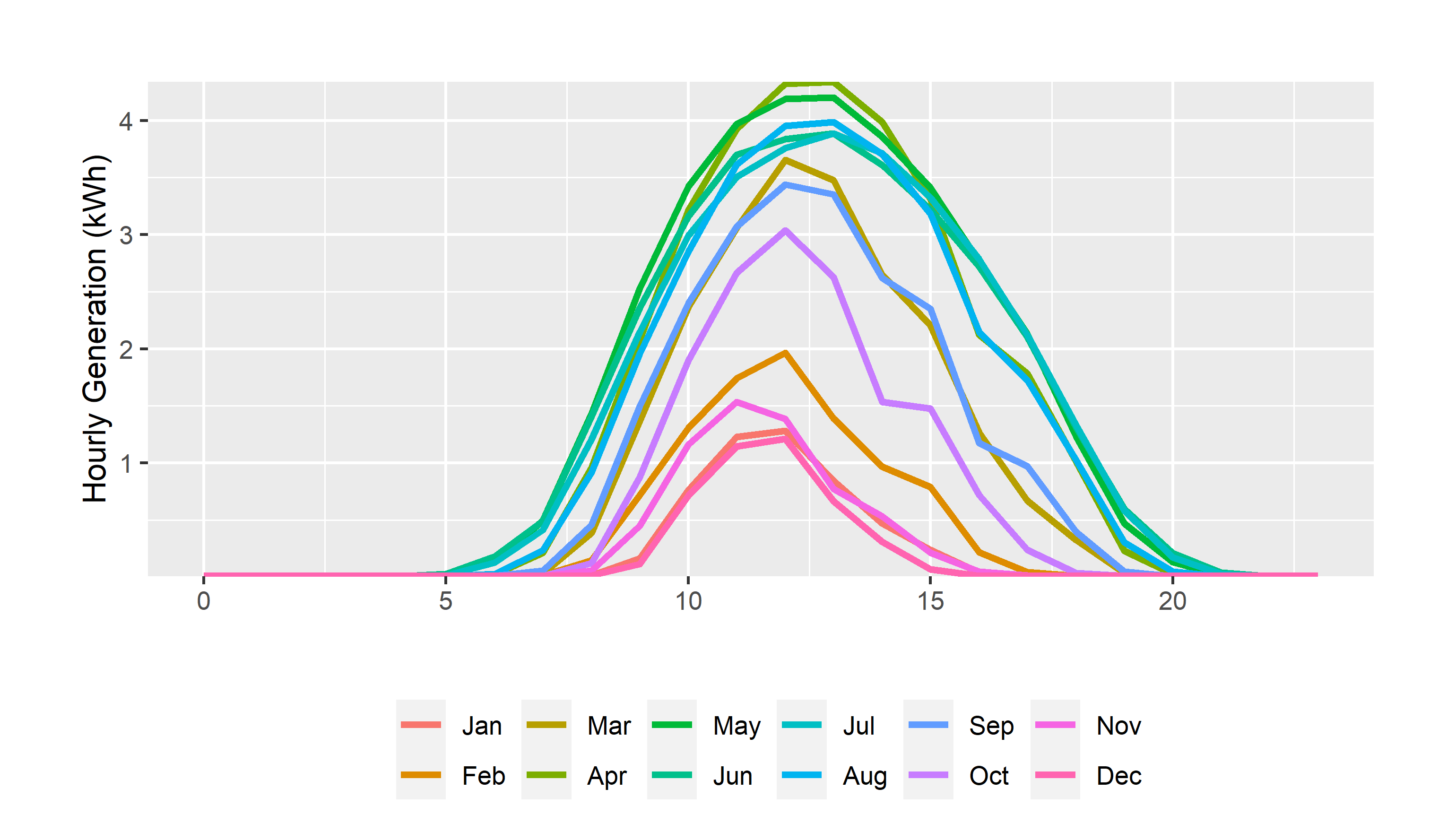
We’ll use this a lot in the upcoming assignments for ordering provinces from west to east, for example. And, you’ll see it in the next few graphs we make. So, let’s go back to our core data and set this up right, with month factors in the right order.
#using read_csv, upload the data
solar_data <- read_csv("hourly_solar.csv",locale = locale(tz="America/Denver"))%>%
  mutate(year=year(start),
         month=fct(month.abb[month(start)],levels=month.abb),
         #set up hour and day indicators too - we might want them
         hour=hour(start),day=day(start))

hourly_summary<- solar_data %>%
  #group by hour and month
  group_by(month,hour,measure)%>%
  summarise(value=mean(value,na.rm=T))#create a variable for the mean and ignore any missing values
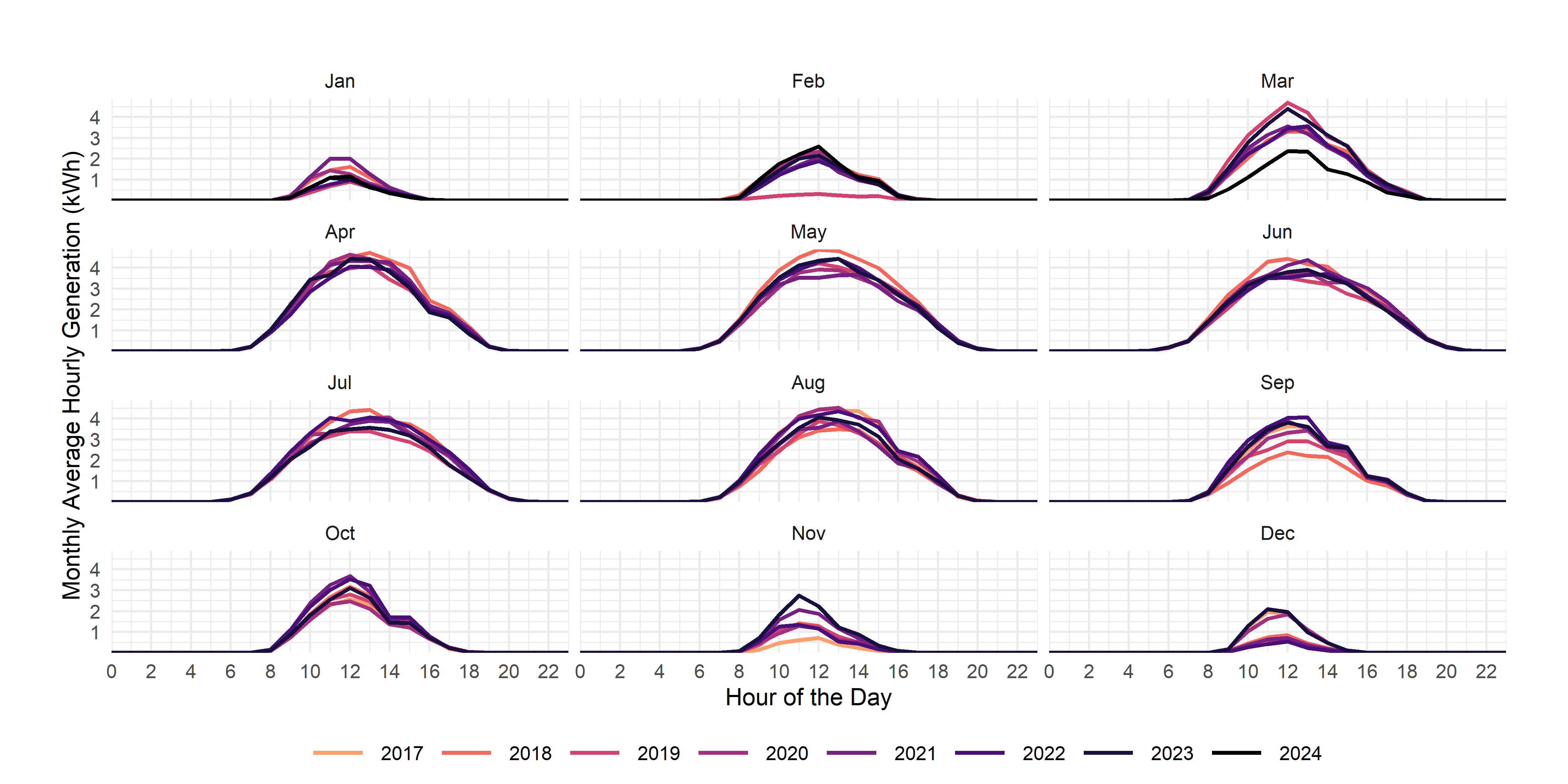
I’d like you to re-create this graph, but with facets by month and colors by year.
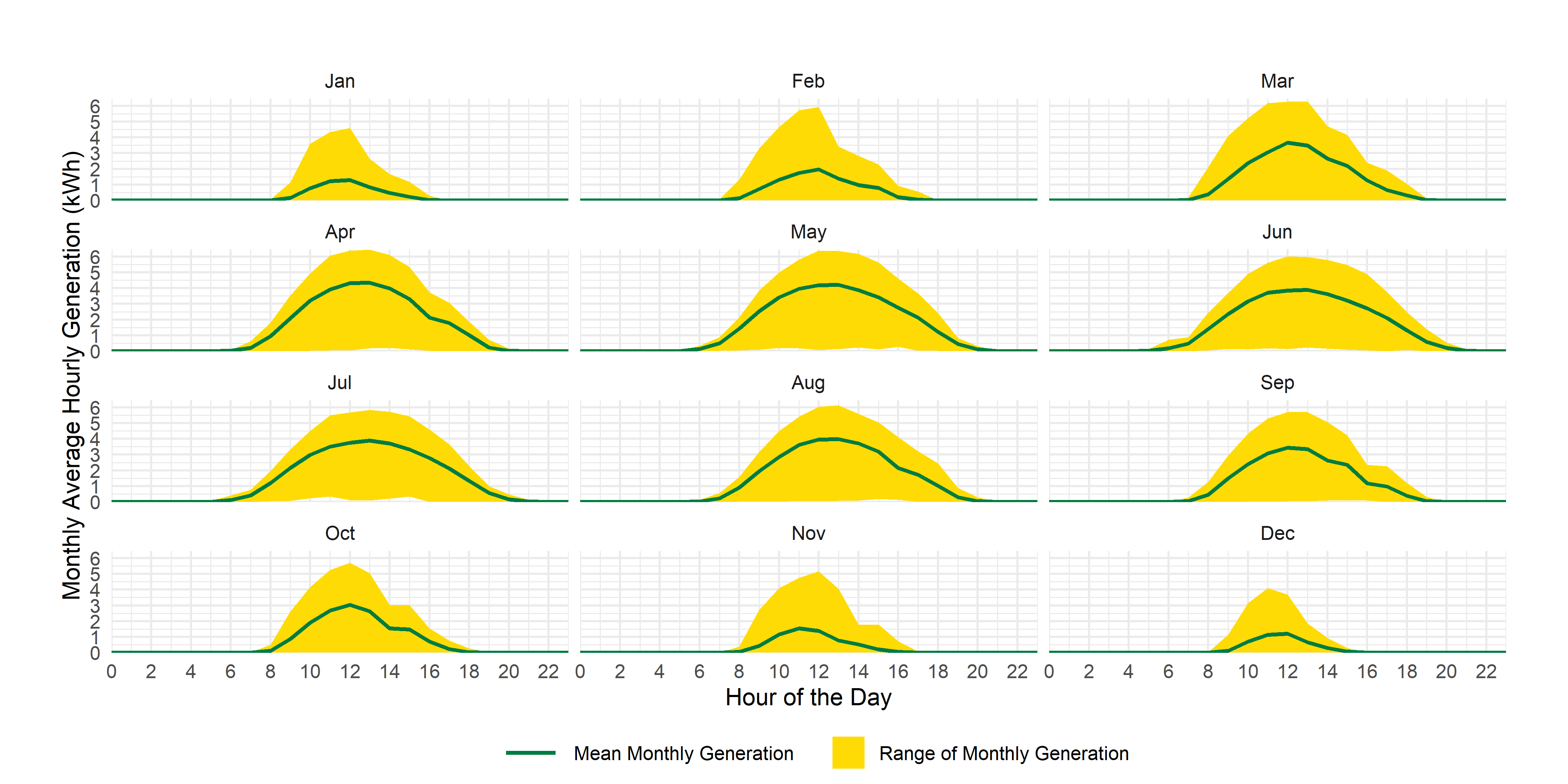
An even larger challenge is to use ribbon plots as we’ve used previously to create something like this:
The Real Power of Forcats
Another fun thing you can do with forcats is group factor levels into categories using the fct_recode command. For example, I might want to group months by season
season_data<-solar_data %>% filter(measure=="generation")%>%
  mutate(season=fct_recode(month,Winter="Dec",
                           Winter="Jan",
                           Winter="Feb",
                           Spring="Mar",
                           Spring="Apr",
                           Spring="May",
                           Summer="Jun",
                           Summer="Jul",
                           Summer="Aug",
                           Fall="Sep",
                           Fall="Oct",
                           Fall="Nov")
    )%>%
  group_by(season,hour,measure)%>%
  summarise(generation=mean(value,na.rm=T),min=min(value),max=max(value))
And, I can then use the re-coded factor variable to graph solar output:
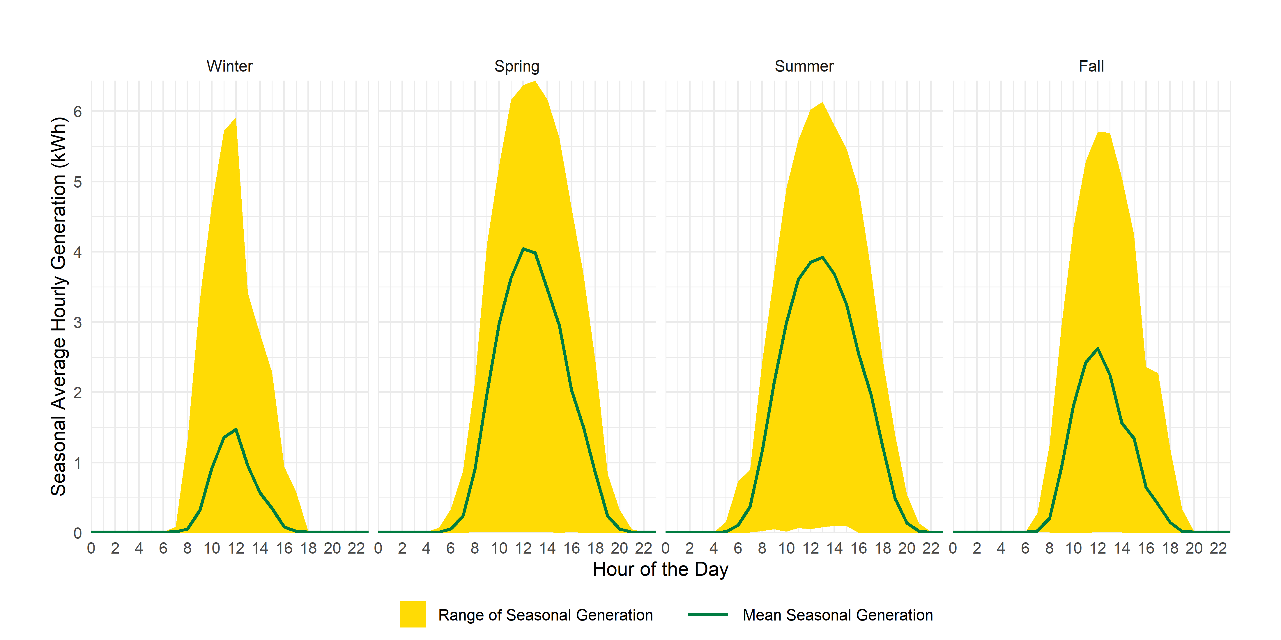
See if you can recreate that one in your markdown.
Net-to-grid generation (a lesson in pivot-wider)
Flat (or long) data frames are very useful for creating graphs and other visuals, but they create a bit of a pain for doing what would normally be an easy operating in a wide data frame, like taking the difference between two columns. In this case, you might really want to know my net generation (or net-to-grid generation) from my solar panels, but that’s hard to do because of how the data are arranged.
Let’s look at an individual hour:
| start | end | measure | value | year | month | hour | day |
|---|---|---|---|---|---|---|---|
| 2017-08-16 16:00:00 | 2017-08-16 17:00:00 | consumption | 0.964 | 2017 | Aug | 16 | 16 |
| 2017-08-16 16:00:00 | 2017-08-16 17:00:00 | generation | 0.843 | 2017 | Aug | 16 | 16 |
| 2017-08-16 16:00:00 | 2017-08-16 17:00:00 | imported | 0.264 | 2017 | Aug | 16 | 16 |
| 2017-08-16 16:00:00 | 2017-08-16 17:00:00 | exported | 0.143 | 2017 | Aug | 16 | 16 |
In this hour, I have periods where I am consuming from the grid (imported) and where I am selling to the grid (exported), but none of my individual data points tell me the difference between my generation and my consumption in this particular hour. There is an easy way to deal with this: pivot_wider.
Let’s first turn our long data into wide data:
solar_data%>%
  #use pivot wider and tell it where to get variable names and values
  pivot_wider(names_from = measure,values_from = value)
and, again looking at the same hour of data:
| start | end | year | month | hour | day | consumption | generation | imported | exported |
|---|---|---|---|---|---|---|---|---|---|
| 2017-08-16 16:00:00 | 2017-08-16 17:00:00 | 2017 | Aug | 16 | 16 | 0.964 | 0.843 | 0.264 | 0.143 |
and, I can use mutate to carry out operations on the columns I’ve just created:
solar_data%>%
  #use pivot wider and tell it where to get variable names and values
  pivot_wider(names_from = measure,values_from = value)%>%
  #create a new variable for net generation
  mutate(net_generation=generation-consumption)
which produces, for the same hour:
| start | end | year | month | hour | day | consumption | generation | imported | exported | net_generation |
|---|---|---|---|---|---|---|---|---|---|---|
| 2017-08-16 16:00:00 | 2017-08-16 17:00:00 | 2017 | Aug | 16 | 16 | 0.964 | 0.843 | 0.264 | 0.143 | -0.12 |
Depending on what you want to do with the data, you might decide just to leave it like this, or, you might want to pivot it back to long form. I’ll show you how to do that now.
solar_data%>%
  #use pivot wider and tell it where to get variable names and values
  pivot_wider(names_from = measure,values_from = value)%>%
  #create a new variable for net generation
  mutate(net_generation=generation-consumption)%>%
  #pivot back to long, using all of the date-related items as ID variables
pivot_longer(-c(start,end,year,month,hour,day),names_to = "measure", values_to = "value")| start | end | year | month | hour | day | measure | value |
|---|---|---|---|---|---|---|---|
| 2017-08-16 16:00:00 | 2017-08-16 17:00:00 | 2017 | Aug | 16 | 16 | consumption | 0.964 |
| 2017-08-16 16:00:00 | 2017-08-16 17:00:00 | 2017 | Aug | 16 | 16 | generation | 0.843 |
| 2017-08-16 16:00:00 | 2017-08-16 17:00:00 | 2017 | Aug | 16 | 16 | imported | 0.264 |
| 2017-08-16 16:00:00 | 2017-08-16 17:00:00 | 2017 | Aug | 16 | 16 | exported | 0.143 |
| 2017-08-16 16:00:00 | 2017-08-16 17:00:00 | 2017 | Aug | 16 | 16 | net_generation | -0.120 |
Note though that I’ll use the data in wide form for the rest of this exercise, in other words, I am not executing that last bit of code.
So, now you’ve got a feel for pivot_wider, we can do some summarizing of my solar power system.
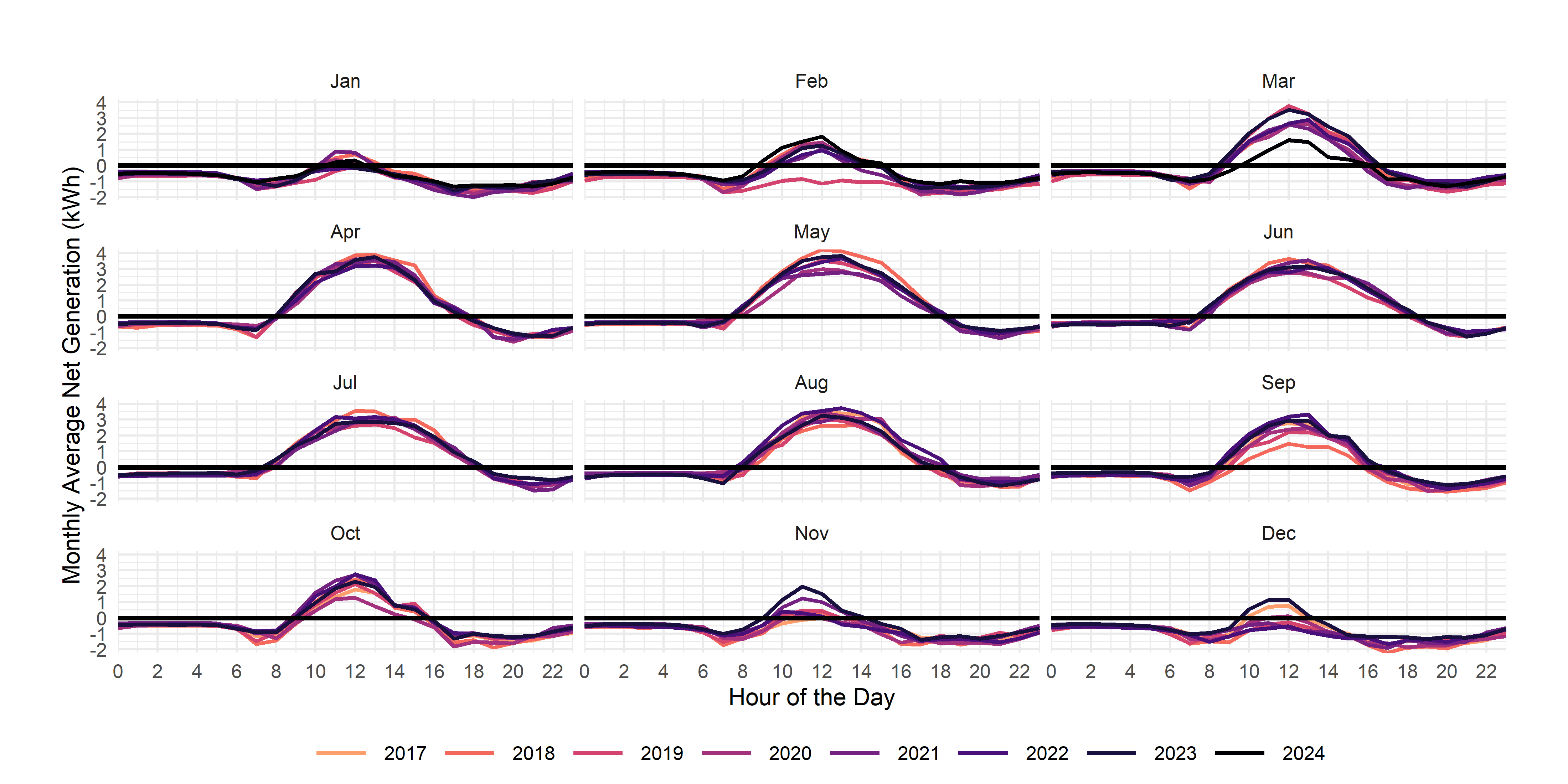
For your exercise, I’d like you to re-produce the following graph using the net_generation variable you created:
And, in case you’re interested, here’s some overall summary statistics:
Total household generation, consumption, imports and exports (MWh)
| generation | Net Generation | Imports | Exports |
|---|---|---|---|
| 56.1 | -3.24 | 42 | 38.8 |
The value of electricity: left_join
How much does electricity cost? Or how much is my power generation worth?
Electricity is priced through variable and fixed costs. Through those costs, I pay for the power itself, for distribution, and for transmission. You can see, for Edmonton, all of the costs of electricity here.
The Utilities Consumer Advocate has a historic rates tool here. And, the Market Surveillance Administrator has a (now dated) spreadsheet of bill charges here.
Let’s break down the different parts:
Electricity: I can either buy via the default (regulated rate option (RRO) pre-2025 and now the Rate of Last Resort (ROLR)) price, or I can sign a contract. I get paid the same price for net generation as I pay for electricity consumed. In my case, have historically dealt with Alberta Co-operative energy and now with Enmax, and switch plans in September and March, picking a higher rate in the summer months to take advantage of my net-to-grid generation.
Distribution: Distribution combines a daily rate and a per kWh rate for electricity delivered to my house (the imports field in the data). Current rates, shown here, are $0.69953/day and $0.01712/kWh.
Transmission: I pay for transmission as a per kWh charge (all variable). Current rates are shown here, and sit at $0.03825 per kWh.
Riders: There are a series of rate riders that apply to my bill. These are:
- Balancing Pool Rider (Rider G, $0.00135/kWh)
- System Access Service True-Up Rider (Rider J, $0.00094/kWh)
- Transmission Charge Deferral Account True-Up (TCDA) Rider (Rider K, $0.00458/kWh)
Riders change over time, as they are temporary mechanisms to recover specific, special costs outside of normal rates. You’ll notice that the riders are all variable charges as well.
Finally, we pay a Local Access Fee of $0.01324/kWh.
I’ve given you a data file of all of bill parameters for my household. This includes the regulated price (rro), the price I pay on contract (my_price), and all the variable (bill_var) and fixed (bill_fixed) determinants of my bill per month.
The way to figure out my bill is: bill_fixed + imports x bill_var + net_generation x power_price.
And, if you wanted to figure out what my bill would be without solar, you could use: bill_fixed + (bill_var + consumption) x power_price.
And, lastly, from last week’s data exercise, you can figure out how much the generation is actually worth on an hourly basis, using AESO prices. Again, to save you the trouble of scraping and stacking the data year-by-year, I’ve given you a data file here.
So, let’s value some power shall we? And figure out how much my bills are down with solar.
Combining all the data we have
#we need to combine our solar_data with the billing data and the aeso prices
aeso_data<-read_csv("aeso_prices_monthly.csv",locale = locale(tz="America/Denver"))%>%
  mutate(aeso_price=aeso_price/1000) #get prices in $/kWh to be in common with everything else
billing_info<-read_csv("billing_info.csv")%>%
  mutate(year=year(date),
         month=fct(month.abb[month(date)],levels=month.abb)
         )#get common identifiers
solar_data<-solar_data %>% left_join(aeso_data)%>%left_join(billing_info)
Notice how, as you run this, you’ll get confirmation of 1) Joining, by = c("year", "month", "hour", "day") and 2) Joining, by = c("year", "month") so that you know that you’ve added hourly AESO prices and monthly billing info to your solar data. You should now have a data set that has about 50,000 observations of 26 variables, and looks like this:
#we need to combine our solar_data with the billing data and the aeso prices
p_graph<-solar_data%>%
  select(start,aeso_price,my_price,rro)%>%
  pivot_longer(-start,names_to="rate",values_to = "price")%>%
  mutate(date=ymd(paste(year(start),month(start),1,sep="-")))%>%
  group_by(date,rate)%>%summarize(price=mean(price,na.rm=T))%>%
  ggplot()+
  geom_line(aes(date,price*100,colour=rate),linewidth=1.5)+
  theme_irpp()+
  scale_x_date(breaks=pretty_breaks(12), expand=c(0,0),date_labels = "%b\n%Y")+
  scale_y_continuous(breaks=pretty_breaks(), expand=c(0,0))+
  scale_color_brewer("",palette = "Set1")+
  labs(
      title = "Leach Household Electricity Prices",
      y="Monthly Average Price (c/kWh)",x="")
ggsave(p_graph, file="prices.png",dpi=300,width = 8,height=5)

p_graph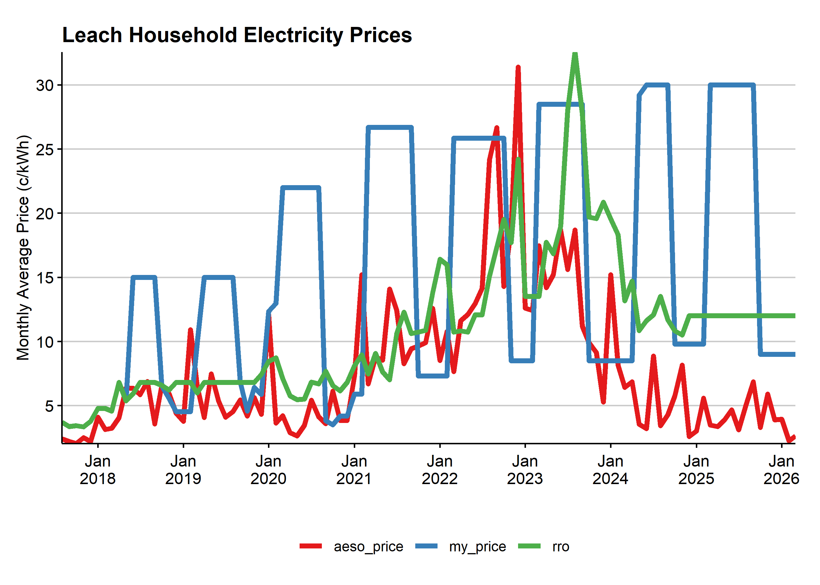
| start | end | year | month | hour | day | consumption | generation | imported | exported | net_generation | aeso_price | date | rro | my_price | transmission | distribution_var | rider_dj | rider_l | rider_k | rider_j | rider_g | laf | dist_daily | bill_fixed | bill_var |
|---|---|---|---|---|---|---|---|---|---|---|---|---|---|---|---|---|---|---|---|---|---|---|---|---|---|
| 2017-08-16 16:00:00 | 2017-08-16 17:00:00 | 2017 | Aug | 16 | 16 | 0.964 | 0.843 | 0.264 | 0.143 | -0.12 | 0.02 | 2017-08-01 | 0.037 | 0.037 | 0.031 | 0.009 | -0.003 | 0 | 0.003 | 0.002 | 0.001 | 0.008 | 0.591 | 18.3 | 0.051 |
Now, we can find out some billing info. For example, for the RRO pricing, I could develop estimates of my bills with and without solar, and the savings from solar.
solar_data%>%
  #filter(year!=2025)%>%
  group_by(year,month)%>%
  summarize(#use the mean bill_fixed since it's a monthly charge
    #use the sum of monthly dist * variable bill determinants per kwh
    #use the sum of monthly net consumption (-net_generation) times the price
    solar_rro=mean(bill_fixed,na.rm = T)+sum(bill_var*imported)-sum(net_generation*rro),
    #just rro on consumption
    bill_rro=mean(bill_fixed,na.rm = T)+sum((bill_var+rro)*consumption),
    savings_rro=bill_rro-solar_rro)%>%
  group_by(year)%>% #average monthly savings (n() is the number of observations in the group)
  summarize(bill_rro=sum(bill_rro)/n(),
            solar_rro_prices=sum(solar_rro)/n(),
            savings_rro=sum(savings_rro)/n(),
            )
For your exercise, I’d like you to build the following table:
Average monthly savings from solar by year
| year | savings_my_bill | savings_rro_prices | savings_aeso_prices |
|---|---|---|---|
| 2017 | 20.8 | 20.8 | 17.3 |
| 2018 | 72.3 | 48.6 | 62.3 |
| 2019 | 82.6 | 49.8 | 53.0 |
| 2020 | 125.7 | 54.2 | 44.0 |
| 2021 | 157.6 | 71.2 | 94.0 |
| 2022 | 161.4 | 94.5 | 117.1 |
| 2023 | 171.5 | 149.0 | 103.1 |
| 2024 | 146.1 | 87.2 | 37.4 |
| 2025 | NaN | NaN | NaN |
I’ve had my solar power system so far for 8.5 years, and it’s saved me $NaN in power bills. Not bad for a system that’s supposed to last 25 years, especially if you think that power prices are going to remain high.